Arch
443/646: Architecture and Film
Fall 2010
Playtime (1967)
Jacques Tati, director
|
Arch
443/646: Architecture and Film Playtime (1967) |
|
Discussion
Questions: For this set of questions you are given an image, sequence or set of images from the film. Prepare a critical commentary describing the significance of these images as they pertain to the film itself (production, technique, plot), to the critical commentary that Tati is making about Modern Paris, and to the larger discussion of the role of Modern Architecture, as it relates to the idea of the Metropolis and the criticism of American influence on French values in the film. Feel free to refer to any of the films we have already viewed this term for comparison purposes. Each thumbnail below is linked to a larger screen capture of the same image in case you need to see the image in greater detail. Your name is BELOW the series you are assigned. For the in class discussion, please paraphrase your answer. |
link to extra reading on this film
please also read "Architecture in a Mode of Distraction" on page 171 in Lamster's Book.
| x | 1. | 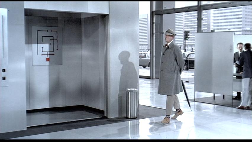 |
 |
 |
x |
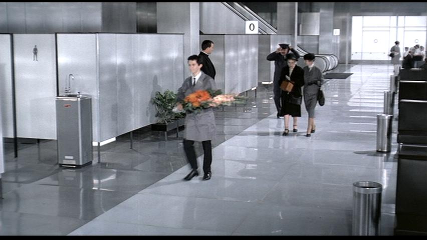
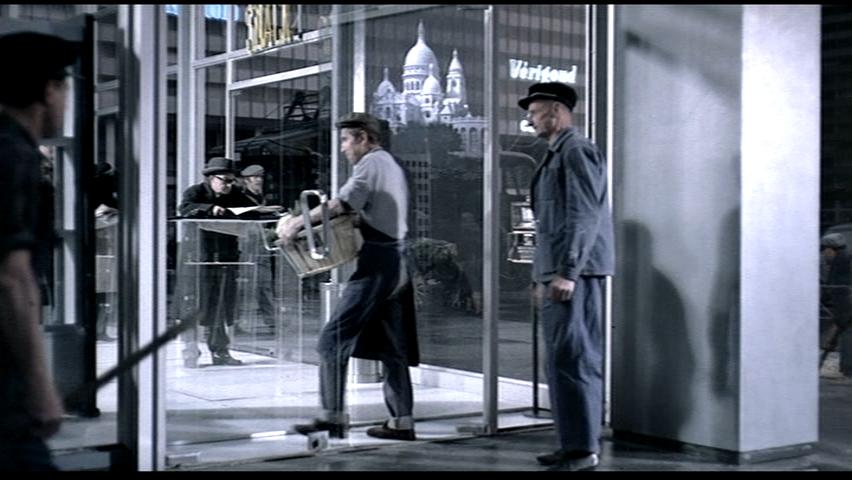
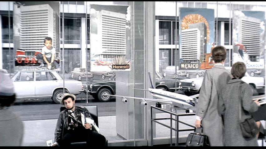
Elaine Chau In Playtime, Tati keeps the plot to a minimum. Oftentimes, he uses the long shot in framing a particular view, but does not define a narrative for it. The long shot enables the viewer to focus on multiple actions within the frame simultaneously as one would do in real life. The simple gestures from an ensemble of characters are enough to generate independent and collective narratives. Since there is little camera movement within a scene, particularities of a location are only understood by the actions of the characters within it. In the first scene, it is difficult to comprehend the space as it consists of generic furnishings that do not define any specific condition. The colours within the frame are also very uniform and muted, which adds to the ambiguity of the space. The viewer is given the opportunity to scan across the frame and focus on whatever they deem to be interesting. As viewers become immersed into each extensive frame, the world of a Modern Paris starts to read as a bizarre new reality. Throughout the film, there is an ongoing commentary on modern technology. In the second scene, a man is trying to operate the machine and it is clearly a heavy mass of confusion. The piece of technology is more complicated than it needs to be in relation to the task that it is required to do. Modern technology has a tendency to impair rather than to enhance the happenings of daily life. The playful use of sound in this scene expresses not only the machine as an incomprehensible device, but animates the space in a way that makes it awkward and uncomfortable to be in. The individuals appear to be very disconnected from the spaces and the materials that make up these spaces. The materials are concrete but they also carry a sense of intangibility when placed in relation to other spatial components of similar nature. In contrast, Many of the aspects associated with modern technology can be linked to modern architecture. In the third scene, architecture appears to be an ambiguous construct that individuals are struggling to navigate. As the man explores the space around him, an alcove in the wall becomes an elevator shaft at an instant. This is only one of several awkward encounters between individuals and the architecture around them. A lot of modern architecture is indistinguishable from one another, so it can be said that the elements within it also resemble one another. These changing elements can be seen as a commentary on the idea of functionality over identity. The Modern Paris looks for efficiency through uniformity, but all it yields is uncertainty and disorientation.
|
|||||
| 2.
|
 |
 |
 |
||
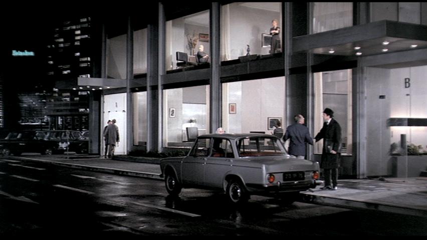
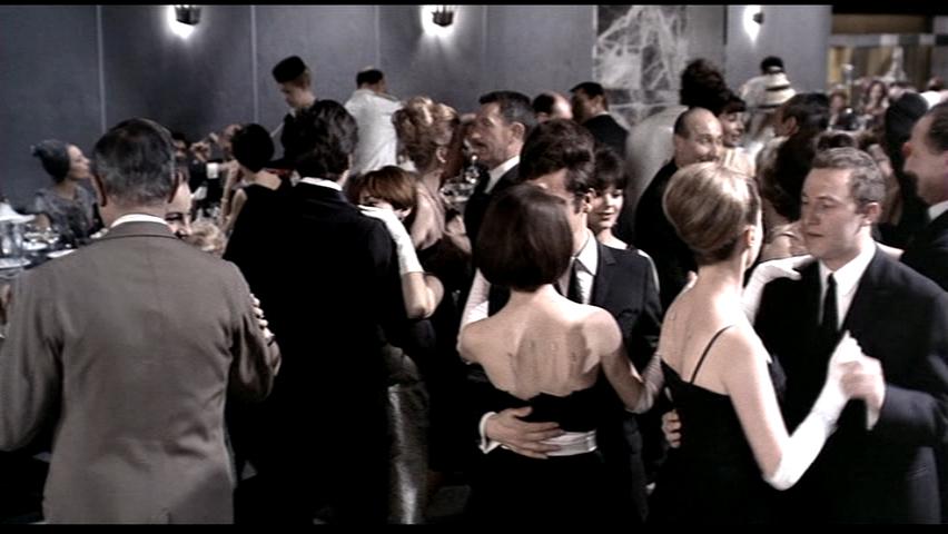
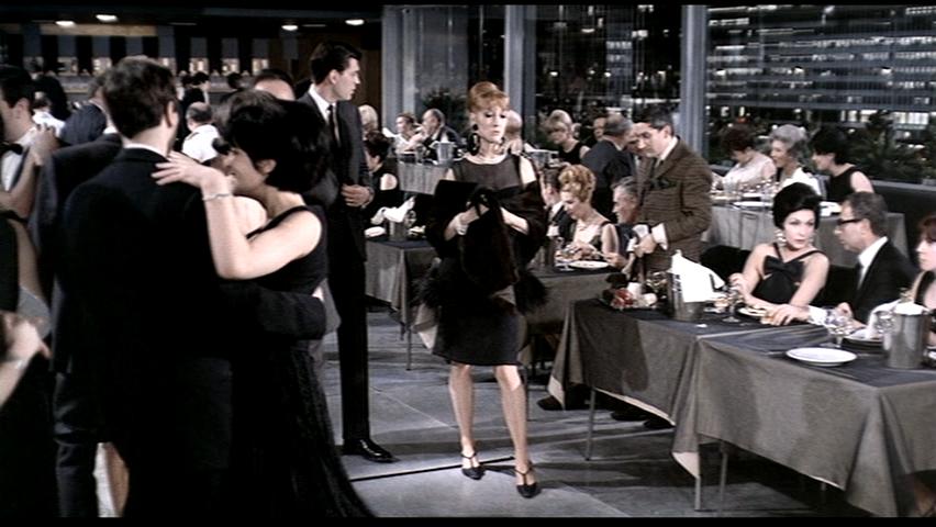
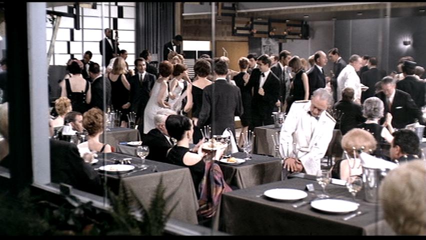
Anne Cheung This set of images propelled the irony of the plot. Hulot has been waiting and searching for his appointment with the officer, yet keeps getting lost or distracted by the modern city. After a day of wondering in the city, he bumps into old friends that he met in the army by chance. He is invited into his friend’s house without realizing that the official that he has been searching for is just living next door. The setting in this scene allows the audience to see the overview of the situation form a 3rd person’s point of view. The two apartments are only separated by a wall and have a glass wall facing to the street. To the audience, there is no privacy at all in these homes; however, the characters in the movie does not seem to be bothered by the openness of their private living space at all. There are moments, where the partition wall between the two apartments is completely covered by the exterior column from the camera’s point of view. Visually, it looks like the two families are watching each other, but they are only watching TV on the wall. The technique is evidently used to emphasize the irony.
|
|||||
| 3. | 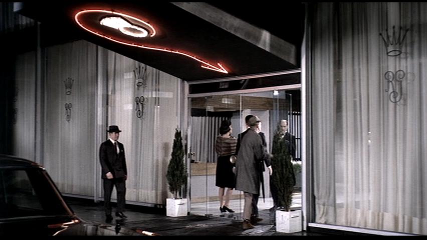 |
 |
 |
||
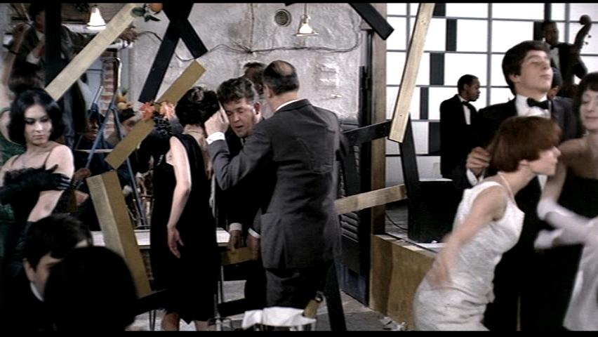
Andrew Dadds The images are of Monsieur Hulot coming into contact with the imperfections of modern architecture. On an obvious level, the broken décor and shattered glass door speak to the fragility of modernism and modern buildings. But what appears as a critique is actually one of possibility. The events present themselves as things that would typically kill any sort of “party”, yet Tati turns them into a vehicle for spontaneity. The door handle reassumes its position within an imaginary door, and the wood becomes a partition and door into an “exclusive” party niche. Tati looks for the imperfections in modernism, as a means of creating humorous and quirky commentaries. Tati stands on a line of half-critique, half-phrase in the contemporary section of Paris, seeing the potential for situationist like encounters, and getting lost within a “Playtime”. Monsieur Hulot’s quirky and oddball character is reflected in the many confused details within the movie, running legs under a partition, a flapping ticket, architectural details not measured correctly, etc. Deriving from this is a commentary that embraces imperfection. Imperfection is what makes things human. It is precisely the imperfection within a door handle assuming itself as a door without an actual door, and a fallen detail becoming a screen, that summarizes Tati’s commentary that imperfections create sponteniety and improvisation, essentially making human what might appear cold and sterile. Tati creates a lively atmosphere through the use of mishaps and quirky misfortunes within an otherwise scale less environment.
|
|||||
| 4. | 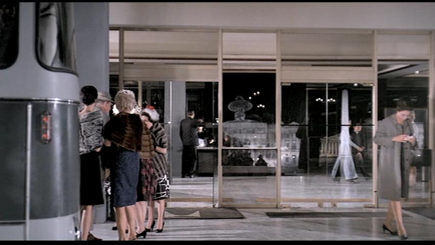 |
 |
 |
||
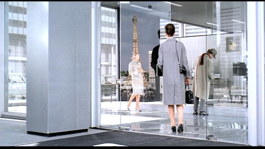
David Domanski The sequence of still frames are made relative by these minor moments of transition which are rather subdued, distracted, and most significantly, the reflection of traditional Paris in the floor to ceiling glass doors of modern, "International" style architecture. In the first image, the woman is departing with her group to another destination in the Modern Paris. She takes the moments before being heralded onto their bus to take photographs. She stands just outside the building entrance, facing away from the building. Her view falls on the real urban context of Paris, which is only shown to us as the audience through the reflection on the modern building's glass doors and curtain walls. Her attention is fallen to this reality, where the rest of her group is hustling and bustling within themselves and the modern built environment, fully distracted and engaged in a sort of virtuality. The bus is there to take her away before she has proper time to dwell on the experience. In the second image, a man with groceries in a basket is leaving the drugstore, of on what comes across as a routine delivery. As the delivery man opens the door, a next image of the real urban setting of Paris is reflected in the door glass. Yet his attention is focused, intent on his destination. A suited man bids him good morning. His preoccupation is not inside this building, but at its threshold between outside. As the delivery man exits the door is not closed, fresh air enters the building, while the image of a monumental historic building remains, a reflection on the glass door. In the third image, the woman is being called to catch up from behind the end of her group, entering a modern building containing a modern product convention. They, in their marvel of modernity, in their excited distraction, carry on quickly into the building to the many booths. Their friend, on the other hand, pauses a moment at the door, catching glimpse of the Eiffel Tower reflecting on the door as she swings it open. She turns, beholding this sight intimately in reality for a moment, before carrying on into the building. In the background, a blonde woman wandering through the building momentarily passes through the reflection of the tower, making it appear for a moment that she is wearing the top of the Eiffel Tower as a hat. Tati criticizes the imbalance of importance in the modern life of Paris, causing distraction, dissolution of reality and the inception of a virtual realm on which the people play out their day to day lives - dissected of tradition, the cultural influence of a conglomeration of influences in the discourse of Paris.
|
|||||
| 5. | 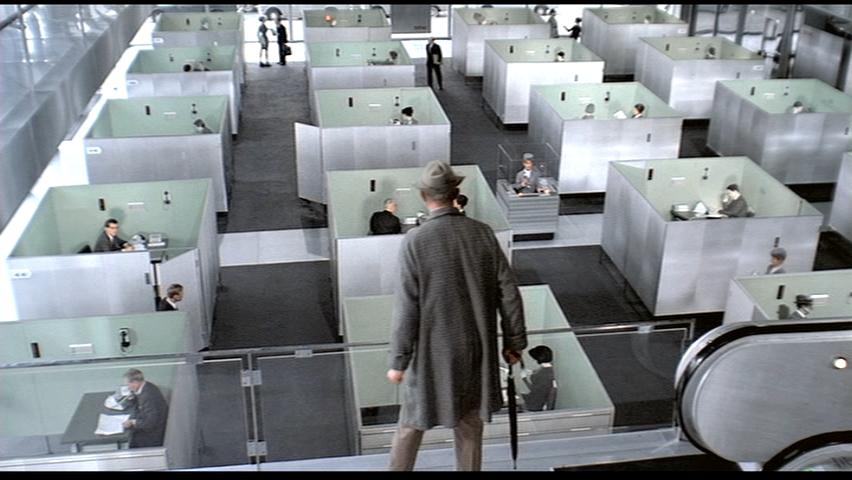 |
 |
 |
||
Mark Kim The three images depict scenes where Tati displays how modern architecture has disconnected our senses from tangible realty as well as how it can be a hindrance to our ability to perform tasks instead of assisting. In the first image, we see how modern architecture has separated everyone into their own private cubicles that create barriers that forces workers to long routes and use phones to communicate with people just couple of meters away. Modern architecture, which is thought to improve our living conditions by promoting cleanliness and efficiency, has disconnected our sense, which in the case of the first image is the visual impairment created by cubicles. Only Mr. Hulot, who is on the second level sees the absurdity of the cubicles. The second image is a receptionist that seems out of place. She is in the middle of the office but cannot see anything because of the cubicles. The third image is shows how the all glassed conference room creates an unnecessary distraction. We see amusing Mr. Hulot outside trying to find the way in and the businessman getting distraction that takes attention away from his work.
|
|||||
| 6. | 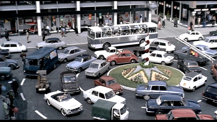 |
 |
 |
||
Peter Kitchen There are a variety of references and relationships that these 3 images have with Tati’s Playtime. Specifically with the subtle techniques in which they are shot with respect to curved versus straight movement.
|
|||||
| 7. | 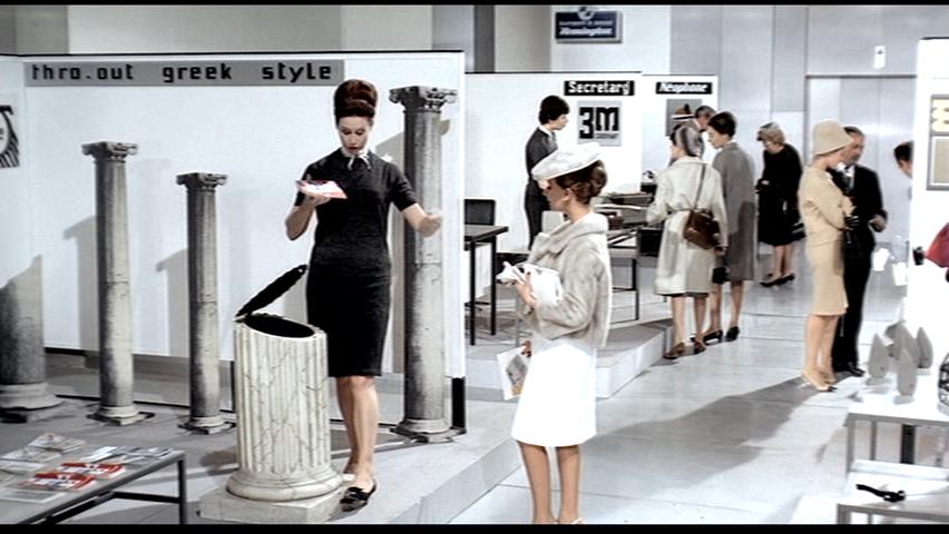 |
 |
 |
||
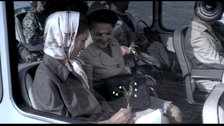
Renee Liu What is Fancy indeed? Is it “thro-out greek style” garbage can? Is it funny foldable glasses? Or is it a piece of silk kerchief with Eiffel Tower image on it? Or is it simply a piece of flower? The modern Paris to Tati is a totally unacquainted city in which the tradition has to be either thrown away or hidden behind the counter. And the ridicules inventions are exhibited in the spacious hall and admired by the modern tourists.
|
|||||
8. |
 |
 |
 |
||
Andrew Ng From the images shown, the question is inconsequentially about the chairs in each of the images.
|
|||||
| 9. |  |
 |
 |
||
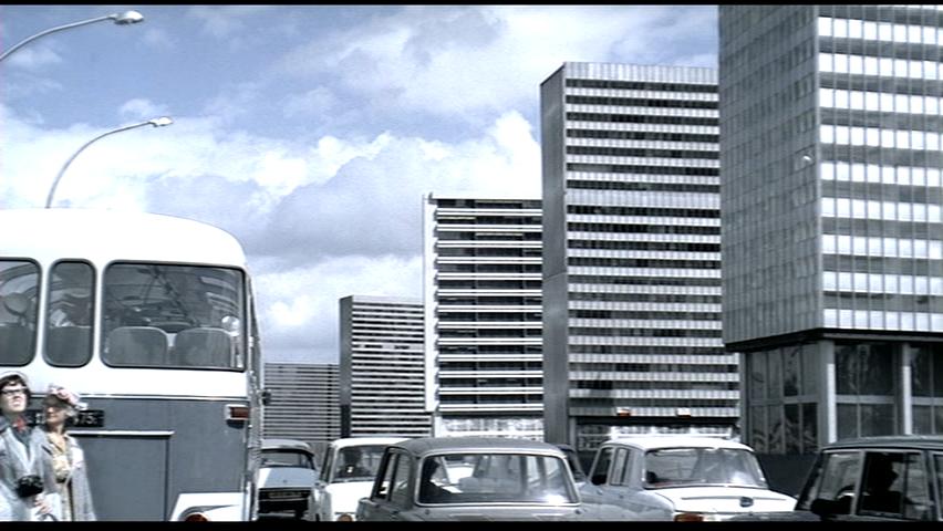
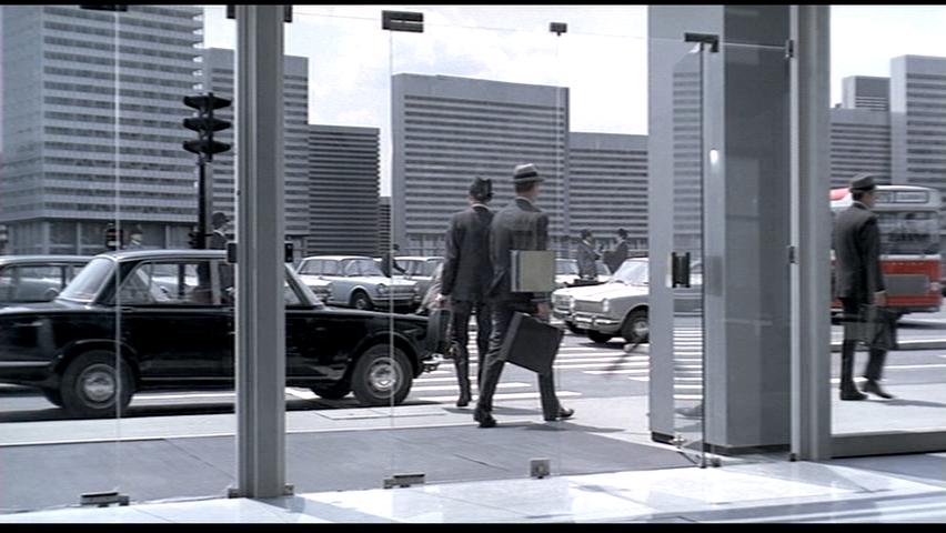
Connor O'Grady While viewing the movie Playtime and the extra reading regarding Tati and playtime, it is evident that the three images compile together to create a critique of modern architecture in Paris. Each image evaluates a different conception of the architectural makeup of the city. As the buildings stand as objects in a field, they all read as a homogenous array. These structures predominately made of glass and steel all seem to all have such similar qualities that it marks the change of architecture as a machine that responds to the industrial revolution and the use of simplistic, “functional” design. The buildings represent a symbol of this new architecture that is unifying architecture all over the globe and destroying individual culture and impact on society. As seen in the second image when the tourists get off the bus it is quite obvious that the buildings seem to draw little attention, yet one can hear a few people mention the similarities in buildings from their respective homes. The technique of repetitive building elements and repetitive car elements, develop an imagery of a loss of culture yet, the directors skepticism in the change in order to create more functional, efficient design, aimed for better living is what is apparent throughout the movie. The city not only seems to lose its character and become a single entity it also does not necessarily prove a more enjoyable affective living condition. The use of floor to ceiling glass in the doors and ground floor atrium spaces affords a new connection between the inside and outside that seems to remove the threshold between the street and the interiors of the buildings. However the removal of this threshold makes for a thinner envelope and a more welcoming interior, it creates confusion for the individual as is seen when the man accidentally runs into the close glass door. The third image is also a moment when the director uses the 70mm camera and shooting style to frame and connect the buildings across the street within the glass doors. It provides a window into what can be recognized as another element of homogenous space. The repetition of elements reflects upon the critique that Paris is dissolving into an “Everytown” much like Things to Come or the machine style city in Metropolis; both lacking of culture and difference. The “Americanization” of the Parisian culture is due to mass production and globalization. The tourists in the movie seem to be blown away about how similar the cultures are and the items that they use. The buildings do not seem to interest them that much and from the posters in the lobby they look like buildings found all over the world (international style). Tatis use of movable buildings reinforces this reuse of set in order to emphasize the idea of repetitive, almost “boring” architecture. Much like how in both Image 1 and 2 some of the buildings look identical and yet they are different scenes. The end result is a negative criticism and skepticism of Paris in its turn to modernity.
|
|||||
| 10. | 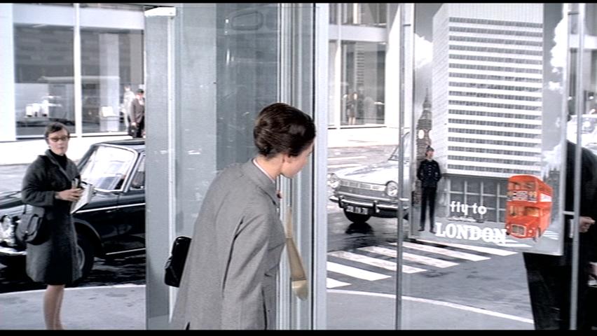 |
 |
 |
||
| James Strong (for third photo, look carefully at the scarf)
The significance of the three photos has to do with the statement that the movie is making about modernism. When in the tourist kiosk Barbara sees a series of posters on the wall, each of them has the same building on it despite being for a city somewhere else in the world. Despite having the same building on each poster, the posters are decorated with images that we would generally recognize as being from another area of the world – for example the London poster has the iconic police officer and red double decker bus. There’s an interesting moment that happens shortly after viewing the posters where Barbara walks into the street a sees what is almost exactly the poster for London England in her field of vision – complete with double decker bus (though the Paris bus is green, not red) and a police man directing traffic. Through these images the director is commenting on the nature of modernism – the perpetual replication of clean straight lines and glass buildings – they give the people who occupy them no sense of place and they can be replicated in cities all over the world without making a cultural statement about the places in which they are built.
|
|||||
| 11. |  |
 |
 |
||
Eric Tai
|
|||||
| 12. | 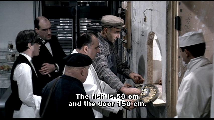 |
 |
 |
||
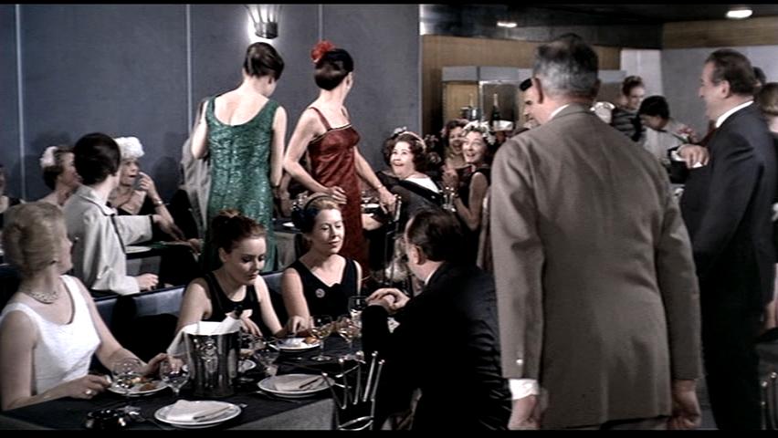
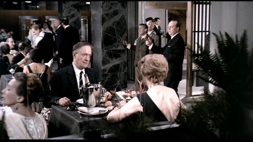
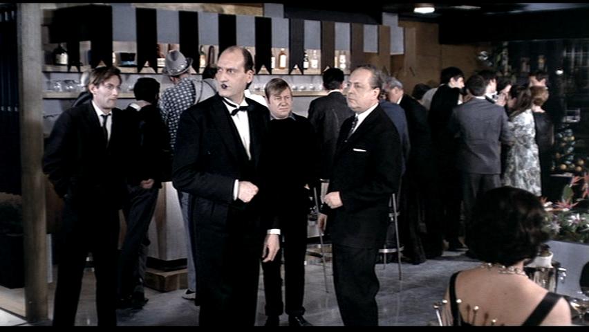
Bei Wang All three of my selected images are from the second half of Jacques Tati's film, Playtime, during the evening spent at the Royal Garden night club. The first half of the movie takes Mr. Hulot through a Paris that is very cold and sterile, with identical streets, buildings and corridors everywhere. A soulless mechanical city of glass and steel where everything looks the same. This is reflected by the posters of the buildings of Paris which all appears identical. The elevator shafts which leads to corridors which looks identical confusing Mr.Hulot. The suited guy in the waiting room going through flawless, mechanical motions of sorting through his file, providing perfect contrast to a very confused and flustered Mr.Hulot which seemed lost in his surroundings and unable to fit into this very robotic and sterile environment.
|
|||||
| 13. | 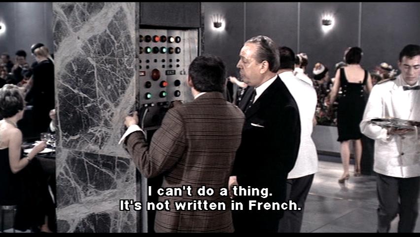 |
 |
 |
||
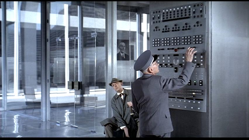
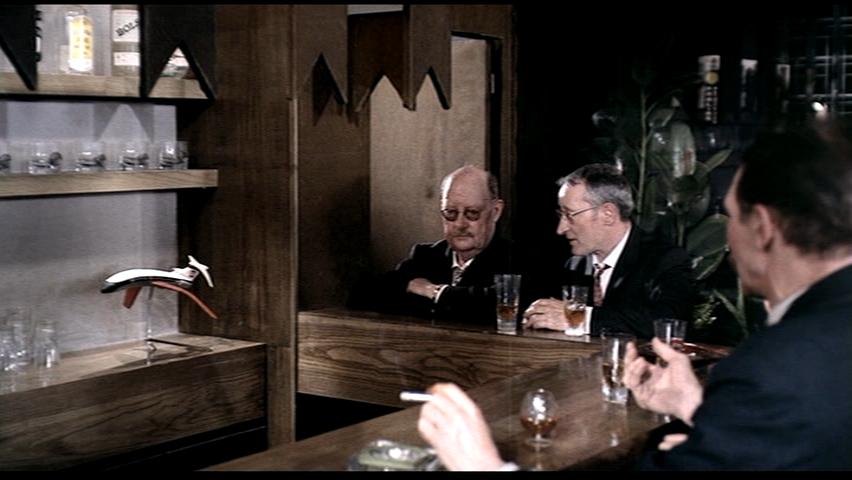
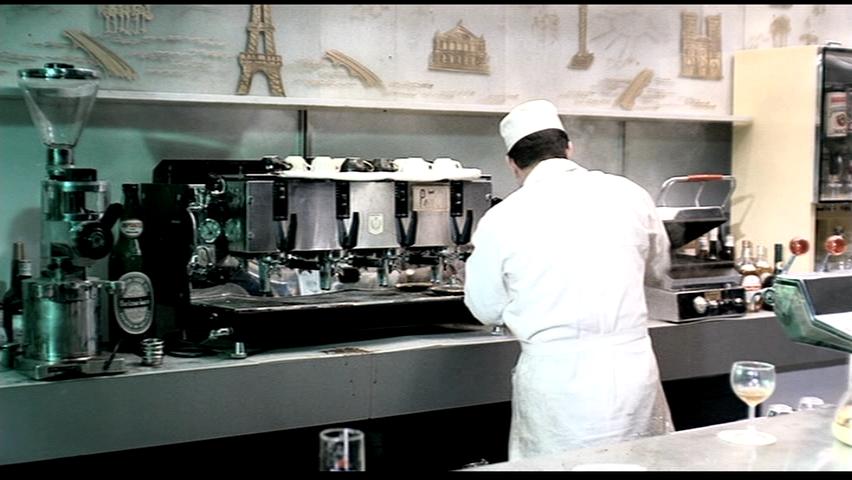
Stephen Wenzel (ignore caption in first image, look at woman's back in second) Each of the three images pokes fun at issues of climate control and comfort in relation to the modern architectural environment. All the images are from the nightclub/restaurant scene on the establishment’s opening night. They illustrate the benefits that the technology can bring, but also mock modern society’s dependence on it. The modern buildings in the film were designed in the international style and, as such, were meant to be the same wherever in the world they were constructed. The designs have no consideration of natural ventilation and cooling, only the brute-force method of mechanization. As such, the first image shows two men, in front of an incredibly complex climate control panel, struggling to find out how to lower the temperature. This exaggerates the complexity of technology in contrast to the simple way that people lived in the past. Like in the film “Metropolis”, the machine is seen as powerful and somewhat incomprehensible. The control panel is hidden away out of site, built in to the column. It is meant to be inconspicuous; if it is too much for the average person to understand, then it should be left out of sight and out of mind. The next image mocks this idea as the mechanical system forcefully makes its presence known. The second screen shot is taken after they manage to turn on the cooling. It shows a woman’s skin being stretched and distorted by the power of the air conditioning fan. This scene again takes the stance that maybe new technology isn’t always best. Air conditioning is shown not as a gentle, humanistic comforter, but as a brutal machine that does not have the delicacy to deal with humans. The scene also criticizes the modern design process with its emphasis on speed and efficiency, key aspects of the modern metropolis. In a hurry to produce, all new buildings have become clones of each other. Construction is rushed to a point where the restaurant is opened while the construction crew is still putting on the finishing touches. There is no time to properly consider the detail of the program of each place. The air vent is placed without any consideration for the layout of the restaurant. This foolish lack of attention in design is brought into focus through the wildly exaggerated effect the fan has on the woman. The final image shows a model plane behind the bar drooping and melting from the unbearable heat. Later when the cooling turns on, the plane quickly reverts to its rigid position. The melting plane is used as a film technique to exaggerate the temperature of the room and the speed at which it regains its shape emphasizes the immense power of technology.
|
|||||
| 14. |  |
 |
 |
||
Lisa Wong
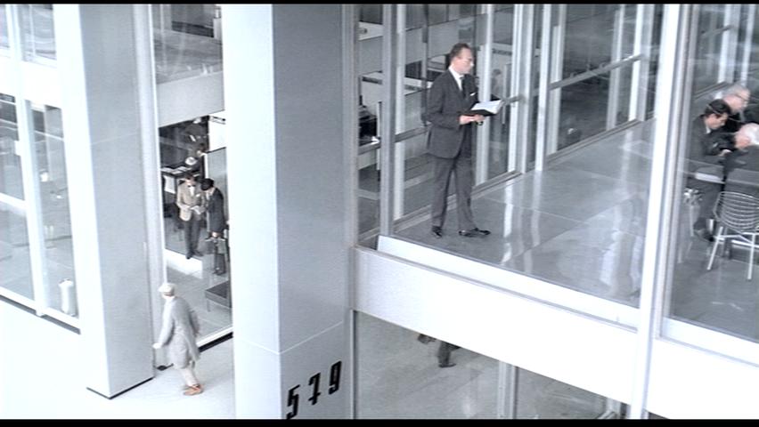
The first two images take place during the restaurant scene of the latter half of the film; the third image takes place when Hulot gets lost amongst the offices in Modern Paris. Through the colour and right-angled geometry of the set, the director comments on the blandness of Modern Paris. The tone in the images is primarily grey, as can be seen in the interior of the restaurant and in the exterior of the office building. In the interior, for example, the columns have a stainless steel and grey marble finish. In the third image, the view of Paris outside the building is as desaturated as the office inside. Even the plants seem grey. Furthermore, the straight vertical lines are very prominent in all three images. In particular, the columns in the first two images stand out as much as the tall Modern buildings do in the third image because of their rectilinear presence. At the same time, they blend with their surroundings due to the presence of other linear, vertical shapes, notably the window blinds in the first two images, and the window frames and balcony of the third. In the end, everything about Modern Paris looks the same, in terms of colour and shape, and it is strongly implied that it is due to the invasion of Modern (office) buildings that had become so prominent in America. To Tati, this is what Paris would be like if these tall, grey boxes took over the city. And, as it is for a maze, the more everything looks the same, the more easily it is to become lost in it. This can be said in the third image, as Mr. Hulot looks on to the city that is lined with buildings that look just like the one he is in currently. Is he in the right building at all? He may as well be standing any of the other buildings he sees in the distance. Moreover, in the first image, Mr. Hulot is giving directions to a stranger using a greyscale map of the city. The second image shows the stranger getting so lost in deciphering the map that he mistakes the patterns of the grey marble wall as the map. With these two scenes, the director makes a direct comparison between Modern Paris and the marble. The director implies that it is easy to become lost in the complexity of Paris as a Metropolis as it is to be lost in the complexity of the marble pattern. He also implies that Modern Paris is like marble in that it has become grey, solid, flat, shiny, and cold.
|
|||||
| 15. | 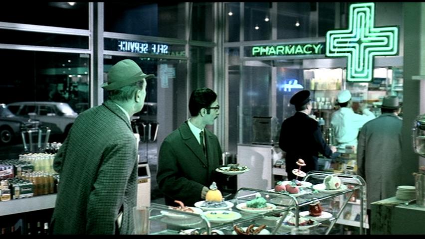 |
 |
 |
||
Sophia Wu The space is all very ambiguous as shown in the images above. Pharmacy and cafe share the same space with no spatial differentiation. It is a critic on modern architecture which has no spatial quality because they look the same and on how much modern society depends on logos and signages. Everything becomes superficial which no deeper meaning inside. People in the services all wear the same custom like uniforms. The white hat and coat are being worn by the stuff In hospital and in cafe. This all red-lights the loss of cultural diversity. Space and the people inhabit in it all looks like they can be in office, sales display, airport and even home. The green and red emphasizes the red and green stop lights which makes life obeys rules and regulations. This two colours are the only colour most emphasized in the film which voice how colourless life has become and only rules govern. Also it echoes with the later scene when the travel bus has to go around the city whole day just to leave paris due to the amount of traffic, which is another trace of automobile in modern society.
|
|||||
| 16. | 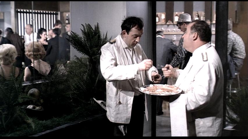 |
 |
 |
||
Ying Xu
|
|||||
| 17. | 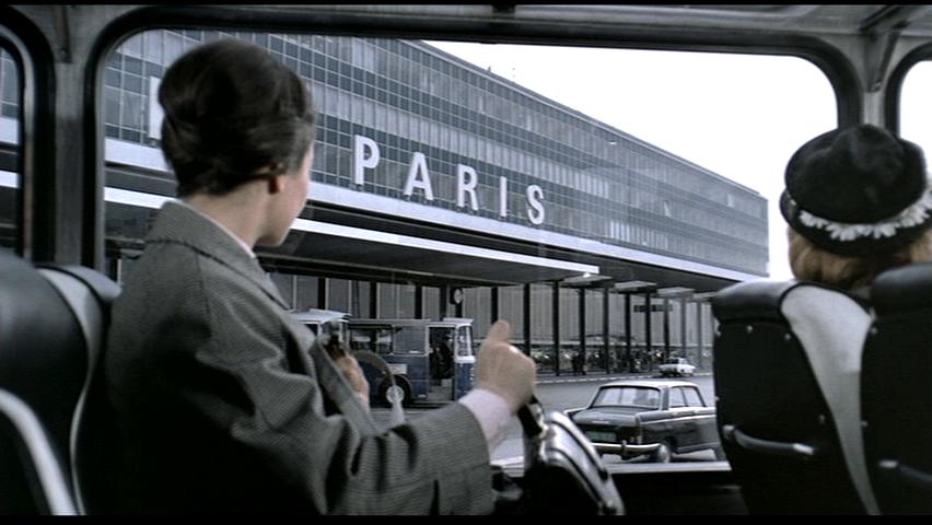 |
 |
 |
||
| Yifei Yuan
These images contribute to the idea of modern city life as mechanical, puppet-like, and sterile. The building in the first images, which do not have any symbolic aspects of the function and atmosphere of that particular building, has identical windows copied and pasted in arrays, like thousands of other modern architecture consists of straight lines, glass and steel support in the city. If it is not by the word “Paris” in front of the building, no one would identify it with an air port. It is just look like an office building. It flattens the diversity and personality of the city, not only by the look of the building, but also the colour. Colour is a general technique Tati used to attract viewers to a particular detail. And on the contrary, the lack of colour indicates the lack of interest. In this image, everything is desaturated, and without contrast. It is to evocate the feeling of modern city as a highly identical and even “boring” repetition.
|
|||||
| 18. | 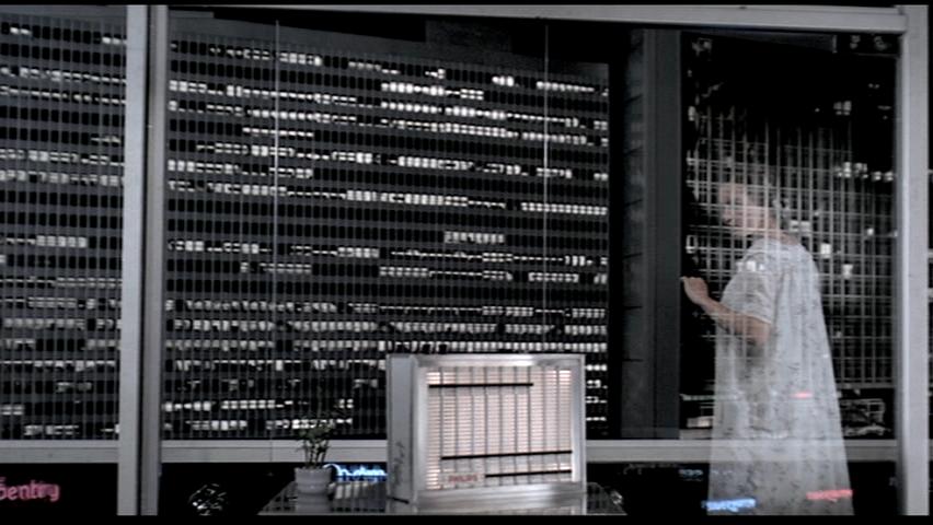 |
 |
 |
||
Jay Zhao In Playtime, I find Tatis’ most critical commentary of Modern Paris is that it will eventually lead to the death of individualism. Tatis depicts his critique of modernism as a generic overload. Everything has become exactly the same, resulting to an overall loss of experience. He makes a statement on mass production and how society as a result, becomes extremely systematic and predictable for the sake of convenience with total disregard to hierarchy and its effect on the human scale. And because of this, the city becomes dull and with a lack of character.
|
|||||
| 19. | 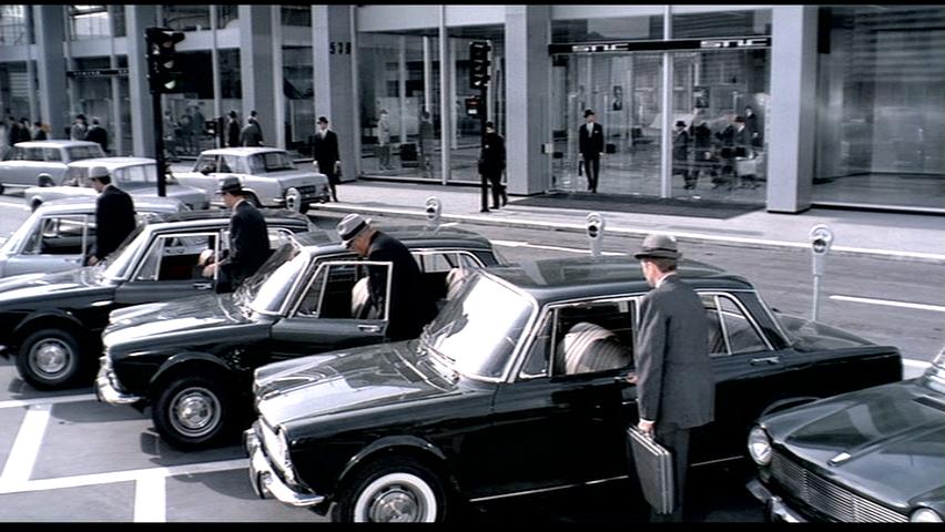 |
 |
 |
||
Carlo Pasini The first frame comes at the end of the first third of the film, when the office buildings are closing. It displays, the notion of uniformity among the men: everyone leaves the office at the same time, wears different shades of the same grey suite, carry subtle variations of the same cut briefcase, drive the same car and checking their metre before saying good bye the same way. Then they each drive off in sequence. This pertains a lot to over-arching criticism the film is making about Modern architecture, as a post-War lifestyle, everyone is very in tune will following sequence and attire which distinguish the places and activities one can part take in.
|
|||||
| 20. | 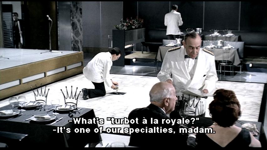 |
 |
|
||
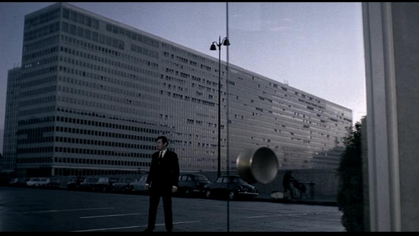
Nicholas Savage (ignore caption in image one - look at the fellow and the floor tile) The set of images play a definite critique on modernity, it being seen an Americanization influence everthing has a sense of manufacture to it, tiles lift off, waiters seem unpracticed, and un caring, a highly glossed and finished exterior, is just a decorated shed, behind the facade the back of house is unfinshed and chaotic. The real paris can only been seen in the horizon, unimortant to the eyes of its new americanized audience. |
|||||
| 21. | 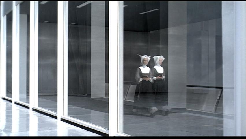 |
 |
 |
||
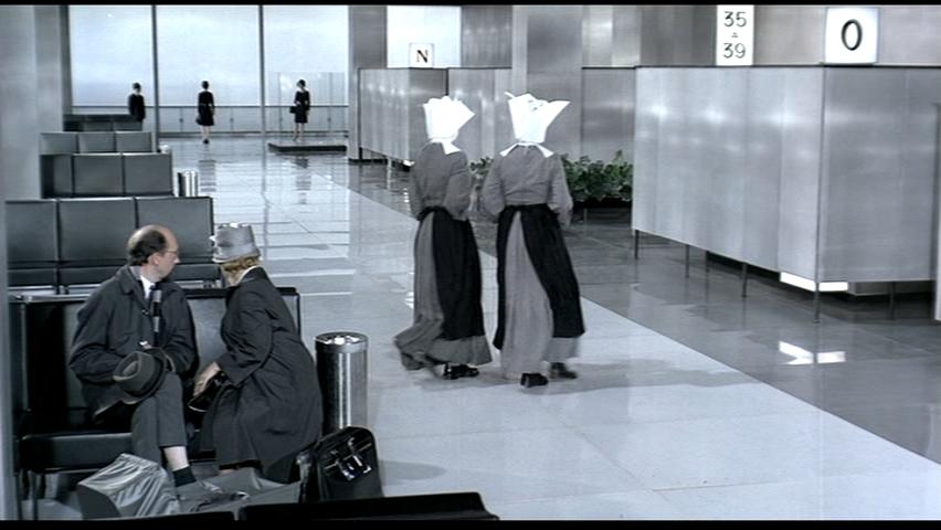
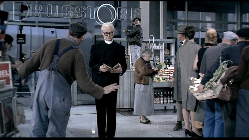
Nicole Bruun-Meyer Jacques Tati’s film Playtime, shot between 1964 and its release in 1967, is a critical look at Modern Paris and the increasing sense of isolation and sterility that technology and progress is imposing on the society. Through Tati’s comical directorial and acting style, he draws the audience’s attention to the idiotic situations that ‘modern’ living has given us. Each of these three frames depicts Tati’s critique on the role of religion in Modern Paris. He uses techniques to juxtapose the nuns and the priest against the others within the scenes in order to highlight these characters in our minds. Throughout the whole film, it is only these two scenes that involve any sort of reference to religion or faith. Tati has been very calculating in his inclusion of these religious figures, primarily as a way of magnifying the difference to the modernised characters. Tati has a way of keeping things separate in this film; the female tourists are kept separate from the male businessmen. He does the same thing with the nuns and the priest. They always stand away from the rest, more as an anomaly that passes through the scene, observed by others with interest. The two nuns enter and pass through the airport hallway, consumed in their own conversation, while everyone around them stops theirs to gaze upon them. They seem oblivious to what is going on around them, but at the same time, have captured the focus for those brief moments. In the scene with the priest, he walks around the café, mostly unnoticed, but again, does not interact at all with the others and seemingly has no purpose to being there; he simply paces back and forth, reading his book. To further his point, Tati again puts a focus on these characters, by creating some humour related to their religious stature. The nun’s headpieces flap as they walk, directing our attention to this piece of clothing so we cannot miss their religious affiliation. Similarly, as the priest steps in front of the sign in the café, the O is lit up, instantly giving him a halo above his head, and again, focusing our attention on the religious aspect in the scene. In the café scene with the priest, Tati especially juxtaposes the calmness of his character with the loud, abrasive nature of the others around him, especially the American tourists. Throughout the film, Tati portrays modern Paris as a sterile and automated city, one full of routine and efficiency, a city full of people that are consumed by technology and the new. The nuns and the priest reflect a more serene and calm Paris, more introspectively focused, with a sense of purpose higher then that of consumerism and gadgets. Contrary to the other characters, the nuns and priest are completely unaware or interested in what is happening around them, the priest even unaware that with the ‘halo’ above his head, he had for a brief moment been closer to heaven then he had known. By contrasting these introverted and extroverted characters, Tati has strongly illustrated the disconnectedness of the modern city. It is clear in the film Playtime that Tati sees modernism and technology as the destruction of Paris’ individual identity. With progress comes globalization, and slowly the city and its inhabitants transform into copies of themselves. They begin to conform and adapt to what is the newest trend or latest gadget, selling their souls for mass production. Through the use of these brief, but important glimpses of the nuns and the priest, he urges the audience to remember another way of life, one focused on the details and pleasures of the moment, not worrying about what is coming ahead. In a similar way, Tati uses the abrasiveness of the American tourists, especially Mr. Schulz, the businessman, that claims he wants to buy the Royal Garden restaurant. Just in the way Tati used the nuns and the priest as a way of reminding us of a previous way of life, he plays on the brash, overbearing style of the Americans as a hint of what Parisians might become, if they are not careful. Their obsession with technology and rational formalist is endangering their individual identity. By separating the religious figures in these scenes, he is showing that they are unaffected by the chaos and sterile formalism of Tati’s modern Paris.
Bibliography: Chion, Michel. The Films of Jacques Tati. Guernica Editions, 2003. Ockman, Joan. “Architecture in a Mode of Distraction: Eight Takes on Jacques Tati’s Playtime”, Architecture and Film, Mark Lamster, ed. Princeton Architectural Press, 2000. Pg. 171-195.
|
|||||
| 22. |  |
 |
 |
||
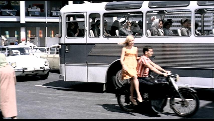
Andrea Nagy The last sequence in Playtime, aptly named “The Carousel of Cars”, depicts a conglomeration of vehicles slowly moving around a traffic circle. The three isolated frames shown, the ice-cream stand, mixing truck, and couple on a motorcycle, best embody the theme of the sequence: city life as a carnival. In direct contrast to the backdrop of modernist Paris, the carnival motif breaks away from the monotony of clean lines and machine-like order and creates an atmosphere of refuge where one might least expect, an urban roundabout. On one hand, one might view the endlessly looping traffic as chaotic and disorganized. However, as with many other scenes in the film, I believe that Tati intends for the sequence to convey a double meaning. For instance, it is possible to perceive a certain natural order and rhythm forming within the disorganized mass, one that deeply contrasts the initial mechanical impression of the scene. Sources: Playtime http://drnorth.wordpress.com/2008/11/12/jacques-tatis-playtime-modern-life-is-noisy/
|
|||||
| 23. |  |
 |
 |
||
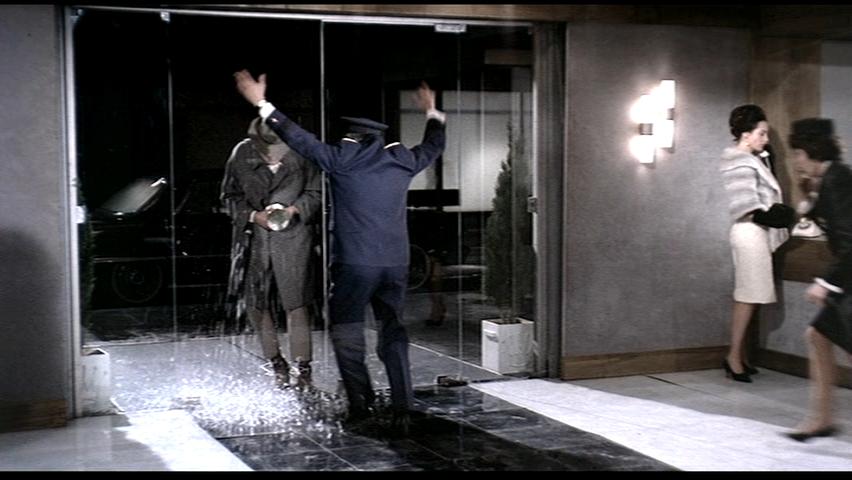
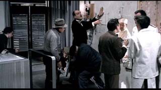
Sophia Zhu Playtime, released in 1967, offers a humorous critique on modern architecture by its director Jacques Tati. Tati shows how the monoculture, standardization, transparency, inflated scale and “emptiness” of this architecture brought about huge change and alienation in people's daily lives. Several themes revolving around the impact of modern architecture are explored—the illusion of transparency, the creation of false barriers and its inhuman nature, and spatial ambiguity. The following set of images renders significance in fruitfully portraying such themes. The architecture style, namely International Style, renders an aesthetic in the extensive use of glass. Because of such, it gives an illusion of transparency blurring the interior and the exterior. In the first image, Monsieur Hulot is speaking to a cheese vender through a security screen outside of a supermarket. Because of the constant use of glass façade and the confusion between spaces caused by the transparency in the film, the audience is unable to tell whether or not there is a physical barrier separating the inside and the outside. In addition, the vender makes a point of only speaking through the screen when addressing customers made it believable that there is a barrier, however, only later to find out that it is an open market with nothing in between. Here, Tati’s preoccupation on the role of modern architecture is reinforced—the unbenevolent quality of glass and how it gives the illusion of transparency, but ultimately is a boundary that cuts people off and distant human relations. Playtime constantly makes us aware of the liminal experience of doors, windows, and thresholds, which is blurred by the transparent quality of glass used in modern architecture. The exacerbation of boundaries transmutes the physical operation of crossing from one space into another into the metaphysical one of entering into an illusionistic world. The second image, taking place in the Royal Garden restaurant sequence, cultivates this theme efficiently. After accidentally shattered by Monsieur Hulot, the doorman continues to open the entrance door by holding the large brass handle in midair, and later he even shifts location to create another doorway outside the coatroom, despite the fact that the real door no longer exists. Surprisingly enough, people wait obediently while the doorman ushers them through the nonexistent door. He opens and closes the invisible door not because it is necessary but because that is what must be done before a person can enter another space. The architecture is delimiting unbounded space into inside and outside, positive and negative quantities, which contributes greatly to the spatial ambiguity created by the modern architectural style. Continues with the theme explored in the second image—delimiting unbounded space into inside and outside, the last image in this set further enhances the invisible boundaries created in modern life. Taking place in the supermarket, Monsieur Hulot tries to walk out of the shop not using the turnstile but rather a bowl of spoons that mimics and mirrors the turnstile. A man watching him insists that it is not an exit and directs him back to exit through the turnstile, which is the proper way out. The idea of boundary created here is similar to that of the nonexistent door situation. Nothing physical is bounding the interior and the exterior space, however, the presence of the turnstile, acting as the threshold, creates the invisible wall. Despite being an open market with no barriers whatsoever, the act of exiting through a turnstile has become a natural part of the modern daily life accepted by the general public. The situation makes the turnstile a doorway, a separation point between the inside and the outside. Ultimately, the existence of the it becomes necessary because it is the way for a person to enter another space. This frustrating yet humorous situation criticizes the fact that modern way of life is accepted as necessary by society, yet they are obstructions to daily life and interference to natural human interaction—Monsieur Hulot ultimately misses the chance to give the present and say goodbye to the American tourist girl in person, because he is caught in the confusion of exiting an open space. REFERENCE
|
|||||