Arch
443/646: Architecture and Film
Fall 2004
Playtime (1967)
Jacques Tati, director
 |
Arch
443/646: Architecture and Film Playtime (1967) |
 |
Discussion
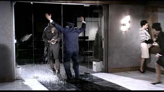
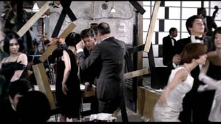
Questions: For this set of questions you are given an image, sequence or set of images from the film. Prepare a critical commentary describing the significance of these images as they pertain to the film itself (production, technique, plot), to the critical commentary that Tati is making about Modern Paris, and to the larger discussion of the role of Modern Architecture and the criticism of American influence on French values in the film. Each thumbnail below is linked to a larger screen capture of the same image in case you need to see the image in greater detail. Your name is BELOW the series you are assigned. Please keep your answers to less than 500 words. For the in class discussion, please paraphrase your answer, do not read it as we are not being left with time for discussion due to the increasing effort you are putting into your work. This is not bad, but we need to keep within the timeframe of the class and make room for general talk. |
link to extra reading on this film
please also read "Architecture in a Mode of Distraction" on page 171 in Lamster's Book. If you don't have it, they have lots of copies of that and my other text in the Architect's Supply store across the street...
| x | 1. | 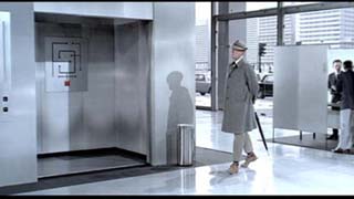 |
 |
 |
x |
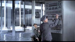
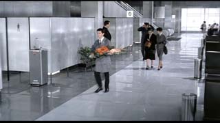
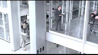
Julia Farkas What struck me as one very interesting aspect of Tati’s movie was the manner in which people or rather characters navigate through the buildings. The three frames are taken from the beginning of the movie and are set in the ground floor of the modernist buildings. The manner in which the character navigates through the building is strongly influenced by certain suggestive signs. In the first image, the floor is dark and light. The characters all walk along the light part of the floor. They take their corners when the floor design allows for them even though the architecture would allow for less severe motion. In the second image, the main character accidentally turns into the elevator. The architecture giving him no indication of what is stable or service space. The maze like map in the elevator gives him little hope of finding his way back. While in the third frame, the porter attempts to navigate the building by electronic means. Yet is left dumb-founded faced with the numerous buttons in front of him. I think the
implied narrative in the three images and indeed throughout the first
half of the film that Tati is trying to deal with the articulation of
architecture and it’s ability to relate ourselves within it and
the fact that we are relying on other mechanical means by which to contextualize
ourselves rather than by means of architectonic articulation. The characters’
navigation through the building leaves him and the viewers disoriented
and bewildered. There is a strong play between signs and symbols rather
than the actual architecture to suggest any orientation. |
|||||
| 2.
|
 |
 |
 |
||
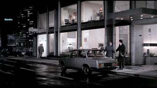
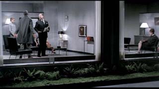
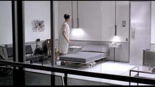
Christian Tognela Jacques Tati interviews Monsieur Hulot about Jacques Tati Jacques Tati
: Bonjour Monsieur Hulot, could you please tell us something about Playtime? |
|||||
| 3. | 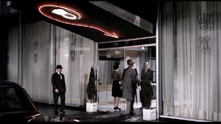 |
 |
 |
||
| Mark
Cichy |
|||||
| 4. | 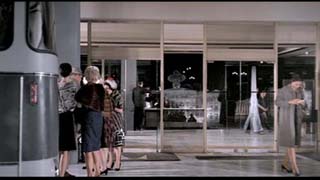 |
 |
 |
||
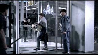
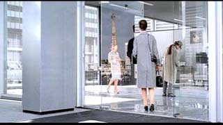
Nancy Gibson Tati has
staged Paris as an amusement park for Americans who are more interested
in alternative venues for American culture than the actual experience
of the real Paris. The historic icons (Eiffel Tower, Sacred-heart Basilica,
Paris Casino) of Paris only appear at a distance or reflected in the doors
of modernist glass buildings where the tourists amuse themselves with
American products. It doesn’t matter that the buildings all look
the same and you can’t tell where one begins and another ends. Everything
is designed to look insubstantial and accessible without actually being
so. Tourists are satisfied with images and scenes of places rather than
experiencing them. Paris is just a picture to admire like the quaint flower
lady on the street. Barbara is oblivious to the flower lady’s business
as though she was merely put there for Americans to photograph. |
|||||
| 5. | 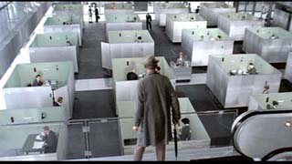 |
 |
 |
||
| 6. | 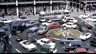 |
 |
 |
||
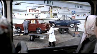
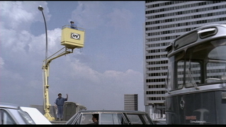
Vivien Liu The scenes from Playtime depict the city as a playground, where the roundabout becomes a merry-go-round, mechanical car jacks become like children’s rides, and the elevated platform of the worker becomes much like a mechanical ride in the background. The particular sequence in the movie suddenly charges the world of Playtime with colour and vibrancy, where cars are now in a range of colours contrasting with the start of the film where buildings and the streetscape are predominantly grey and white. The sense of the playground is enhanced with the use of a very carnival-like music, and relates the movie to its title, Playtime. Tati conveys here the elements of mystery, awe and poetry within the modern society. He is perhaps trying to put more life back into the bland and monotonous city that depicts the modern society with its enormous glass-clad office buildings and repetitive architecture, or even perhaps trying to mock the idea of the modern. Tati attempts to revitalize Paris from the lack of originality and poetry, its participation in the “International Style” which creates intimidating and confusing spaces within buildings (we see this when Hulot continuosly gets lost while looking for his partner M. Giffard). Michael Votruba: The images pertain to the film Playtime by representing technology in Paris. The focus is on machines, particularly cars, representing a new dependance on technology in Paris. Through Tati's critical view he depicts the abserdities of the new technolgy that seems to make peoples lives more stressful and less accomodating. The first provided image represents a traffic circle around which cars are moving in an orderly circular fasion. The cars seems to enter the circle but do not actually go anywhere they just continue spairaling around. At the very center of the circle is a corkscrew monument that in a sense mimics the movment of the traffic. In this Tati might be making a comment on the nature of the automobile as the primary means of circulation within the city. This is however an unrealistic depiction of the way cars actually move through the city. One can imagine the condition if this same traffic circle was imposed on present day downtown Toronto drivers. In this case chaos might be caused because the current minset of city drivers is speed and aggression to reach their target destination. The secound image deals with automobiles being raised and lowered on hydraulic lifts. In this scene we see a man who seems to be a mechanic and a man that seems to be a scientist. Together they are in the process of repairing cars. The lifts seem to arbetrarily be raising up and lowering down.Through this there is a depiction of technology as playful additive to society but no real purpose. The lifts add a new component to the modern city offering a glimpse of a modern playground with cars that seem they are on a 'teeter tauter'. The third
provided images deals with a service lift being used by a workman repairing
a light post. Here there is a juxtaposition between the simple elegant
light post and the awkwardly complex machine that is required to service
the light. This raises certain questions about the mindset of a society
that needs complex machinery to do very simple tasks. The light’s
presence raises implications that affect the city at a larger scale. Repairing
it causes requires a large machine that blocks automobiles and intimidates
pedestrian traffic. The malfuntioning of the lift continues Tati's whimsical
depiction of modern Paris. He shows the lack of efectiveness of technology
offering a viewpoint that it is impractical and prone to misuse.
|
|||||
| 7. | 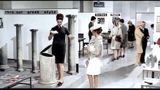 |
 |
 |
||
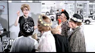
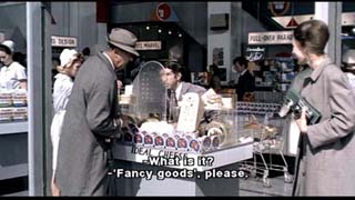
Adriana De Angelis In 1967 Jacques
Tati directed his film Playtime. |
|||||
8. |
 |
 |
 |
||
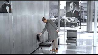
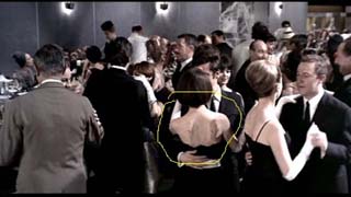
Aaron Nelson For this set of questions you are given an image, sequence
or set of images from the film. Prepare a critical commentary describing
the significance of these images as they pertain to the film itself (production,
technique, plot), to the critical commentary that Tati is making about
Modern Paris, and to the larger discussion of the role of Modern Architecture
and the criticism of American influence on French values in the film. |
|||||
| 9. | 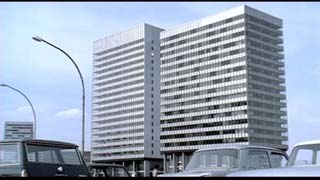 |
 |
 |
||
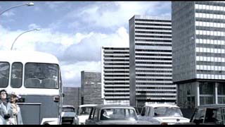
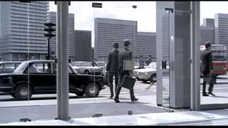
Shane Czypyha Jacques
Tati’s Playtime is a film that depicts Paris as a typical international
city. This look at Paris is of the city as a homogenous space. Buildings
are all nearly identical and a great variety of programs such as offices,
exhibit spaces, restaurants, clubs, homes, drug stores and markets all
occupy the ground floor space. This homogeneity questions the importance
of history in society, as the film turns a blind eye to the historical
and monumental character of Paris. To contrast America to Paris makes
an American city seem like a place of future and technology, as opposed
to a place of history. The American tourists in the film make the city
seem like a satellite America. One tourist says, “I love Paris.”
This statement is ironic because the tourist only sees the homogenous
buildings that could essentially be in any city, and none of the buildings
and monuments that make Paris a unique place. Everything in the film seems
to be on display, behind glass. This is a reflection on the nature of
the American marketplace. It is as though the Paris shown in the film
is a giant infomercial, a grand display of gadgetry and commercialism.
|
|||||
| 10. | 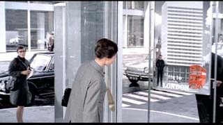 |
 |
 |
||
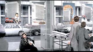
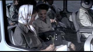
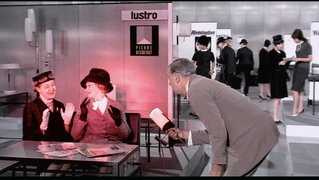
Anne-Marie Armstrong Each image reflects the overarching idea of the alienation of Modern man. The first two images show the interior of a travel agency. The posters advertise various cities, displaying the standard image of an imposing glass and steel building against the backdrop of one or two iconic images of the particular place. The standard Modern building is placed in the foreground, filling the composition and taking precedence over the more textural and vibrant images. In these posters, we see a uniformity and banality that signifies the affect that modern Paris, and Modern Architecture has had upon the lives of the citizens of Paris. Tati communicates the clash between this modern existence and the rich and varied quality of human nature and the natural world. This is also displayed in the third image, portraying the drooping, pitiful bouquet of flowers. This scene follows an image of a similar form of street lamps, effectively communicating that the modern city of Paris cannot support the natural environment, but does transpose its imagery in a cold and sterile manner. In general, the blue-gray hue of the images and the perspectival shifts of the buildings in the posters, communicates a cold and mechanistic quality and a sense of confusion or disconnection to the overall scene. |
|||||
| 11. | 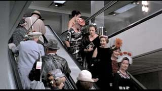 |
 |
 |
||
Elizabeth Myers Playtime
creates an abstract vision on modern Paris. It is Tati’s commentary
on the role of both modern architecture and American culture in the city.
Throughout the film he used the same type of filming techniques; a wide
shot not focusing on anything in particular. This gives the viewer a sense
of being there because he provides an opportunity to focus any number
of events that is happening on screen. He always multiple activities going
on at once, commenting on many aspects of modern life. The viewer can
notice these on his own, without the direct message used in films such
as Alphaville.
|
|||||
| 12. | 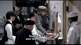 |
 |
 |
||
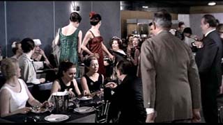
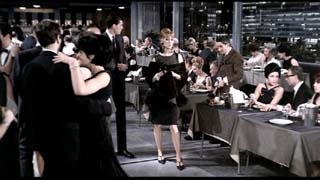
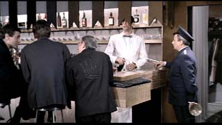
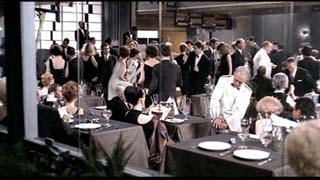
Jim Arvai The film Playtime is a slamming indictment of Modern Architecture. The three
images in the discussion question make a sarcastic gesture on people as
victims of modern architecture and what happens when it is foisted on
them. The three scenes are separate comedic skits with design snafu’s
as the main prop. The second image (bar décor blocking bartender) shows design as fluff arbitrarily imposed without regard to people. Modern architecture ignores the individual person. The third image (waiters hand stuck in broken chair) depicts the shoddy nature of the products of modern design. Modern architecture is transient and will not endure. The Parisian
claim to haute cuisine, haute couture, and all things traditionally Parisian,
when set in modern architecture, is shown deglamourized and shoddy. Parisian
high society and good manners tries to exist in a modern architectural
setting, as portrayed by the nightclub, but the traditional roles of the
club employees and guests are foiled by the failures of modern design
resulting in skit after skit of observational humor. Modern Architecture
is slammed for the creation of the New Modern Paris. |
|||||
| 13. | 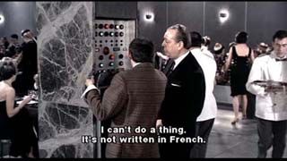 |
 |
 |
||
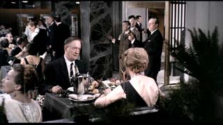
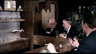
Joshua Bedard Jacques
Tati’s movie “Playtime” is a view of modernist architecture
and the influences of modern technology on society. In the film modern
architecture is depicted as being very cold and sterile. For this reason
we see very little interaction between the humans and the built environment.
Instead they are highly fascinated by the innovative gadgets created by
modern technology. It is not until the upbeat restaurant scene that we
begin to see a flop in these conditions. |
|||||
| 14. | 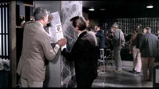 |
 |
 |
||
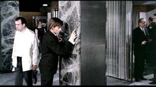
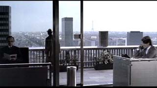
Natalie Drago Playtime is a visual and auditory experience and production that poses questions regarding the contrast between the French lifestyle and new French behaviors determined by a modern context and setting. Those questions incorporate the nature of the petty lifestyles, fixations and traditions that define the French middle class. The technique and effects (automation) employed in Playtime served to demonstrate new possibilities derived from modern technologies and industrialization enforced by the incorporation of modern post war inventions and gadgets. The setting adopted the “international style” of modern architecture, common to east and west societies. This backdrop moves from the background to foreground and vice versa, providing opportunities and moments of interaction between the set and the players, man and his built environment. Despite the interaction with setting we sense the alienation of a society from its space, place and time. Alienation where there used to be comfort and stability, in the correct sense to make unfriendly, hostile or indifferent where attachment formerly existed. Also all players risk being devoured by the depersonalized modernity surrounding them. Tati comments about and targets the depersonalizing effects of modern architecture, the estrangement of Parisian culture from its roots due to American influence and interjections while commenting on the evils of technology by means of gadgetry and technical developments. The plot centers mainly about the evils of technology in the newly modernized, Americanized and commercialized Paris. This contrasts the values of traditional Paris, a developed and highly interactive city with a strong sense of place demonstrated in the urban design, the scale of its urban fabric, where street spaces are cityscapes interconnected and sustaining social activity. The film is reactionary, yet highly experimental, fascinated with analyzing, defining and discovering man’s place in the world. The set is as inhumane as possible, clashing in every way with human nature, human contact seems an impossible act at first. However, as the day passes into night (and then into day again) individuality replaces structure and Hulot and all humanity conquers modern sterility. In essence Tati describes his view on how humanity must overcome hard-nosed technological feats, clod empty redundant design, American interjections by means of new social structure, commercialism and urban design and scale. Instead he looks to reestablish connection between people and place by means of commenting on interactivity and social behavior. Playtime demonstrates the negative aspects of American design and critiques them in the form of an imposed backdrop in France, where the contrast between tradition and modernity, social networks, isolation and alienation are stark and prevalent. In the first image, two men are immersed in a dialogue. This image addresses person to person interaction in the foreground of a stark modern space. There arises a sense of warmth and intrigue that contrasts the cold, inhumane setting that flooded in and out of earlier scenes. This could be interpreted as a simple yet charming example of humanity persisting and conquering the contrived form and sterility of the modern architecture and setting, as well as the evils of technology that surround them. In this scene the colors have changed from grays and blues of the earlier scenes to a warmer friendlier more engaging atmosphere. This atmosphere enables more social interaction to occur despite the obvious modern element apparent in its design. The second image depicts an interaction of an individual with setting, place and time. Once again the physical gestures and apparent contemplation of the individual in his setting charms us as with many elements contained in the production of the film. However we still sense a degree of separation and alienation in this scene. The player has greater difficulty relating to his environment than to the man from the previous frame. There is little present in his environment that holds him. He traces the veins in the marble in a moment of solitary contemplation. The radiating veins in the marble could be references to infrastructure, urban design and/or the form that dominated the cityscape of traditional Paris. Alternately the man’s actions could be intended to express the new level of disorientation achieved by the typical Parisian amidst the new and foreign Americanized modern city with its many electronic components and inventions. His gestures also remind us of a rendering movement similar to the swerve of the arrow over the restaurant entrance attempting to direct into the restaurant space. Could the man also be giving a commentary or directive based on the new design of the French landscape? I believe it could be perceived a form of commentary, similar to the directive of the plot. The third image depicts Hulot looking out over a modern skyline, littered with skyscrapers embodying modern form and functionalism. Comparatively to other scenes in the film, Hulot senses an alienation from his environment and perceiving the dehumanizing qualities of this breed of design. His senses are reacting to color, positioning and the obvious sterility that defines the new built environment. Here Hulot has lost all connection with the ground, even the sparsely landscaped terrace doesn’t provide enough sensory stimulation to overcome the view that describes a city that doesn’t correspond to French tradition or custom. He seems to stand as an outsider in the environment of hard line shapes and modern form. Any possible affection for the city are hindered by it’s unfriendliness and inhuman scale. Tati exposes
how the evils of technology and sterile modern design, have the inherent
potential to destroy the urban fabric existing in Paris, upon which lied
the potential for human interaction and interconnectivity within space.
Still the film results in highlighting the human ability and drive to
overcome our environment and potential estrangement. He demonstrates the
positive aspects of the Parisian culture, a social culture, and emphasized
the negative influence that American design and philosophy could interject
into that community. America being the embodiment of capitalist power,
modernist philosophy and cold commercialism, while Paris represents romance,
society and demonstrates the basic human drive for social interaction
and connectivity. Still “the gentle dialogue free satire of the
ups and downs of modern city life, puts charm on an unprecedentedly grand
scale”. Similarly all that occurs in the films occurs on a grand
scale form event to gesture to setting, to emphasize and increase the
impact of all events, gestures and settings. Lastly the film translated
the negative impact of industrialization into the realm of aesthetic reception.
|
|||||
| 15. | 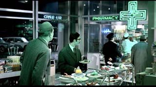 |
 |
 |
||
Federica Martella -- and can you relate the issue of colour to Belly of An Architect as well? In
Playtime, Tati presents us Paris as an ultra-modern city where all the
buildings are characterless. The particular
use of image made by Tati, and therefore of color as an important part
of it, creates comic situations, tells different stories, presents different
characters, critiques the society, and contrasts the absence of interest
of life. At the end of the film the city shows all is variety of colors in Tati’s way of presenting life as a carousel. Transforming momentarily the city in a funfair, Tati replaces all the initial regrets about modernity, new technologies and a modern way of life with a hope. The problem of the contemporary man, his isolation in the modern city, is not about technology, that could be very useful, but in the way he uses it. « Que
signifient la réussite, le confort, le progrès, si personne
ne connaît plus personne, si l'on enlève des immeubles faits
à la main pour les remplacer par du béton, si l'on déjeune
dans des vitrines au lieu de se retrouver dans de petits restaurants où
l'on a envie de parler, si l'épicerie ressemble à la pharmacie
? » |
|||||
| 16. | 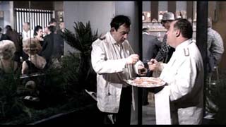 |
 |
 |
||
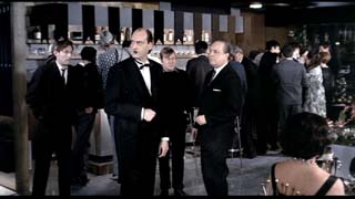
Clementine Chang -- On Propriety: In Playtime, Tati communicates a cold and mundane vision of future Paris. A general feeling of emptiness is made present in the film through the glass and steel architecture of the set and also through the Parisians’ mindless propriety. On the opening night of a restaurant, everything that could go wrong seems to do so, but nonetheless ‘the show must go on’. For example, when Hulot at one point breaks the glass front door to the restaurant, the doorman maintains a proper front as he continues to open the invisible door by swinging the brass handle. This exemplifies the empty meaningless modern lifestyle that Tati tries to convey. Later, another scene shows a waiter checking his proper appearance in a mirror with the plate of food he is to serve. He is much more concern with his perfect appearance as a waiter than his abilities. The portrayed propriety epitomizes the soulless social behaviour that lies in the cold metropolis of the future Paris. Further,
the waiter who rips his pants on one of the modern chairs becomes a reference
figure as the restaurant sinks into deeper chaos. Other waiters, one by
one, come to borrow his clean towel, his jacket, his shoe, and his bowtie.
As he tries to hide behind the pillar, he starts to look like an exhibition
of the evening’s mishaps. His presence meters the ironic atmosphere
of the restaurant. As more things go wrong at the restaurant, the more
the customers seem to enjoy themselves. It is clear that Tati is trying
to communicate through propriety the absentmindedness and lack of substance
that lies in future metropolis lifestyle. |
|||||
| 17. |  |
 |
 |
||
Francesco Mancini link to webpage and to the same as a pdf to preserve the formatting link |
|||||
| 18. | 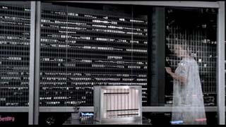 |
 |
 |
||
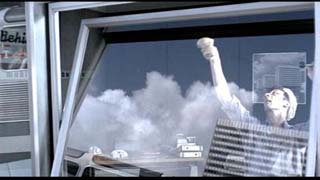
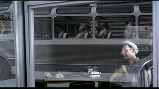
Andrea Krejcik Playtime
by Jacques Tati, is a film depicting modern Paris. Set in dull grey tonnes,
the feel for the modern future is one of concrete, glass and repetition.
Everything is sleek, making the character of Paris lost in the simplified
forms built to update the city. There is a feel to return to the old ways
of Paris within the film. Hints are droped throughout the film in subtle
ways. In the clips of a man washing windows, the reflection of the old
Paris can be seen. It shows that although a new form is built, the character
of what once was will try to come through. |
|||||
| 19. | 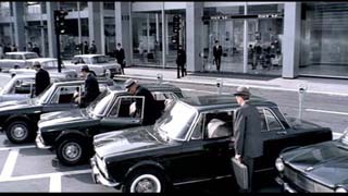 |
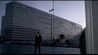
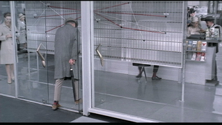 |
 |
||
Liam Brown Playtime is Tati’s commentary on modern-day Paris
and the increasing trend for it to be alike with any other major world
city, especially, as he points out with the group of main characters,
in America. Uniformity then becomes a principle theme to the whole movie,
in his depiction of buildings, people and events. |
|||||
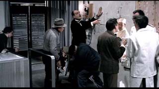
| 20. | 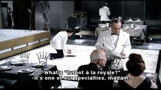 |
 |
 |
||
| Tammy Chau | |||||
| 21. | 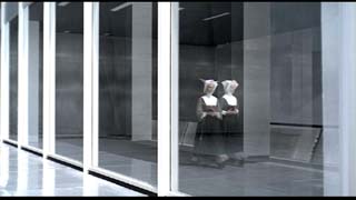 |
 |
 |
||
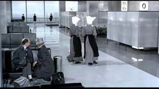
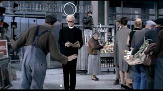
Matt Bolen The images of the nuns and priest which have been captured
from Tati’s film, Playtime, are significant to both the film itself
as well as the critical commentary which Tati makes about modern Paris. |
|||||
| 22. | 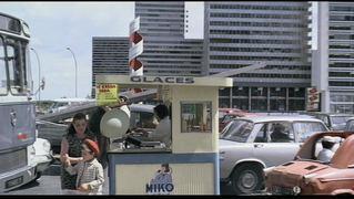 |
 |
 |
||
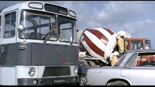
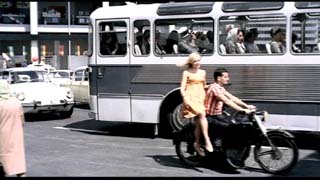
Olivia Keung This image set depicts the spectacle that takes place in the modern city, in front of a society of consumers who stand by passively without participating, observing but not absorbing the images presented to them. The vehicles go around the circular road, advancing but arriving nowhere; passengers in the bus allow themselves to be driven without any awareness to their failure to progress. While many of the scenes that take place on the streets or in buildings have very few people in them, there seems to be masses here, encased in their vehicles, an environment of disconnection. Even the women on the bus don’t seem to communicate. In such large numbers, people are not treated as individuals, but need to be organized as masses. In their cyclical movement, cars and people seem to be controlled by some larger mechanism of which no one is aware. The girl on the motercycle bobs up and down to the same rhythm of the carnival music that everyone else moves to. At the same
time, the circular movement represents a breaking free of the glass and
steel grids. The film has come full circle to the morning, the tourists
are back on their bus, but everyone seems a little more comfortable in
their surroundings. Various splashes of red add to the playful carnival
atmosphere, and they are almost a relief from the suffocating blue-grey
colours that have set the tone of the rest of the film. The ice cream
stand achieves the same defiance: its makeshift structure of cheap plywood
and paper signage mock the sterile skyscrapers as it gives off a sense
of familiarity and friendliness. It has inhabited an unexpected place:
the parking lot. In an absurd way, it seems oblivious to any differences
from its environment in the old city. |
|||||