Arch
443/646: Architecture and Film
Fall 2007
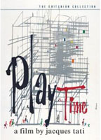
Playtime (1967)
Jacques Tati, director
 |
Arch
443/646: Architecture and Film Playtime (1967) |
 |
Discussion
Questions: For this set of questions you are given an image, sequence or set of images from the film. Prepare a critical commentary describing the significance of these images as they pertain to the film itself (production, technique, plot), to the critical commentary that Tati is making about Modern Paris, and to the larger discussion of the role of Modern Architecture and the criticism of American influence on French values in the film. Where possible, relate the sequence of images to the issues of "the uncanny". Feel free to refer to any of the films we have already viewed this term for comparison purposes. Each thumbnail below is linked to a larger screen capture of the same image in case you need to see the image in greater detail. Your name is BELOW the series you are assigned. Please keep your answers to less than 400 words. For the in class discussion, please paraphrase your answer, do not read it as we are not being left with time for discussion due to the increasing effort you are putting into your work. This is not bad, but we need to keep within the timeframe of the class and make room for general talk. |
link to extra reading on this film
please also read "Architecture in a Mode of Distraction" on page 171 in Lamster's Book.
| x | 1. | 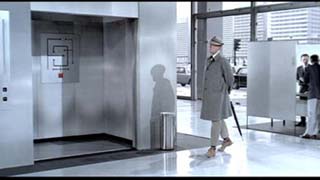 |
 |
 |
x |
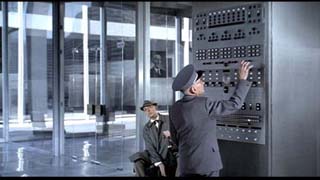
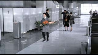
Adam Brady The
first image, in one freeze in time showing Mr. Hulot waiting for Mr.
Giffard, all while getting lost among a maze of offices. Throughout the
scene, Hulot becomes very disoriented, while bumbling further into confusion.
This confusion apparent in the office building is a commentary to a motif
used throughout the film, where Tati depicts Paris as having one common
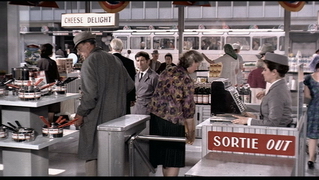
architectural style, yielding a synonymous look to the entire city. One
is easily dumbfounded, losing one’s sense of direction within Tati’s
Paris. In Hulot’s case, he wanders into an elevator trying to read
a very incomprehensible diagram, the elevator takes him to another part
of building becoming lost once again. |
|||||
| 2.
|
 |
 |
 |
||
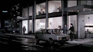
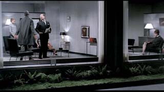
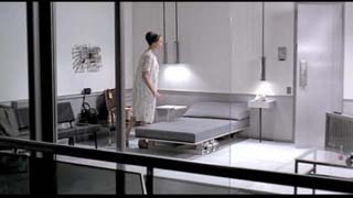
Cassandra Cautius In the film Playtime, director Tati constantly trifles
with the boundary between interior and exterior space. The extensive
role of glass in the film was the vehicle with which he was able to carry
out this play. The role of glass, clearly, had many deep-rooted implications
in the film. But relating to my three still shots; it represents a boundary
between a public realm and a private realm, and not just that boundary
but the clear message that the way we perceive this boundary is rapidly
changing in our modern world based on technological advances for frivolous
gain.
|
|||||
| 3. | 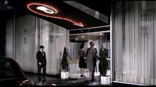 |
 |
 |
||
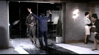
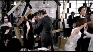
Alex Chan Mr. Hulot’s presence in the film is a spirit of spontaneity that
heralds a break down of Modernist architecture, mechanism and sensibility. |
|||||
| 4. | 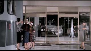 |
 |
 |
||
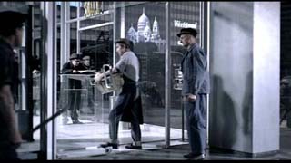
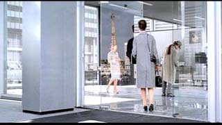
David Henderson Jacques Tati uses reflections as a way of showing the shift from old
world values to modern values. In Playtime, Paris is shown as
a very modern city with rows of identical office towers, lacking any
originality. The same office tower is even seen on travel posters for
other cities. The only times any of the famous Parisian buildings are
seen are in reflections of the giant glass doors of the toneless office
towers. |
|||||
| 5. | 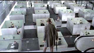 |
 |
 |
||
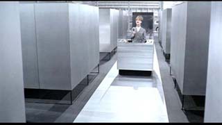
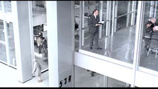
Minwoo Lee The three images portray how the architectural construction in the movie creates an environment of alienation and a sense of being lost. The images suggest the labyrinthine quality of the modern office that obscures the character’s sense of direction and place. This is crucial in expressing the feelings involved with being in an unknown place, in this case, for a tourist in modern Paris. The office environment is a microcosm of a modern society that Tati creates specifically to express his concern towards modern architecture. The cubicles and the hallways resemble buildings and streets of an urban context; general uniformity and lack of diversity makes it impossible for a person to navigate through the environment. It brings up concerns towards the city that modern architecture will create, perhaps fearing that people will feel lost as the tourists are in the movie. The issue of isolation and deterioration of communication is also addressed in the images. People work in isolated cubicles where social interactions are impossible. In the place of social interaction, technological devices stand as the dominant means of communication. In the portrayal of these technologies, there is a sense of inefficiency and constraint embodied in the routines involved in using them where information must be constantly relayed and transferred through numerous terminals just to reach its destination. Through the construction of this environment, Tati criticizes how the capitalistic values of efficiency and progress deprive human beings of culture, and how diverse and intricate mesh of society is replaced by rigid systemization. He criticizes that the sprawl of modernity in Paris will make it bland, stripping it of qualities that make it unique. An underlying current of uncanny is prevalent throughout the images; rooted from the idea that modern architecture and technology will bring about a world that is alien to their traditional ways. A sense of fear in being lost in this new world expressed through Hulot is shared by the audience, especially for those contemporary to the time of the movie’s making. |
|||||
| 6. | 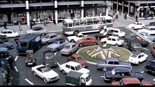 |
 |
 |
||
| Paula
Lee |
|||||
| 7. | 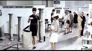 |
 |
 |
||
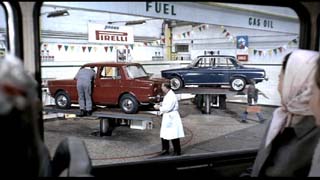
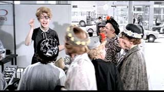
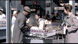
Paula Lee Taking its scene in bafflingly modern Paris the movie suggests social problems of the modern age, subtly in a comical sense. The modernist ideals are reduced to mere iconic repetitions as problems concerning modernism are depicted with images of new inventions and ideas throughout the film. The image of a woman selling eyeglasses, which are presumably flexible, moveable and unbreakable, is presented as its seller demonstrates applying mascara wearing glasses. This modern invention, though it is made for ease, goes against the classical or original idea of eyeglasses known to us and is rather ridiculous or hilarious in the eyes of its viewers. As this eyeglass is presented again and again throughout the movie, the idea of such invention becomes more funny but in a very uncomfortable way. Such theme is shared in the scene of a woman advertising a garbage bin shaped like a Greek column, standing in front of a panel, ‘thro.out Greek style’, brings forth the implications of the modern ideas overtaking the classical orders. The modern society seems orderly, well maintained but as one of the girls at the Royal Hotel says, “ it is same all the time” the orderly maintained Paris, which is close to opposite of real Paris as is, seems awkward, uncomfortable and inhumane. The movie with various types of exemplifications, demonstrates a view towards a different view on modernism. The throwing out of Greek style, or the Classic order which Western society is based upon, embodies a deeper sense of the change in society such as the change in modes of production and living as a whole. The mockery of the new inventions and products shown in the film urges to ask about what the ancient, disorderly really is. The movie suggests that the disorder in society is perhaps what makes life worth living. The accumulation of disorder eradicated the new modern goals of rationalism- the logical, orderly run society without chaos. Such seems to have created a meaningless style, one hallow indication of wealth and luxury to be supplemented by new magnificent environment that seems almost void in content and unliveable. As the picture of a man asking for the fancy cheese, life is but a mere advertisement of personal wealth to the public living in a super modern apartment block of show-windows to the street, exposing the fancy lifestyle within one’s private home- uncomfortable and impractical concepts. Evelyn Lo This sequence of images focuses on consumerism as a reflection of modern society and its dehumanizing after effects. The first two images are screen shots of the exhibition pavilion where a huge array of ‘modern’ inventions are on display. This is among the very first ‘tourist’ stops for the busloads of American tourists who immediately exclaim with excitement that the exhibition is ‘ So American!’ – this very statement is an expression of the globalization of the Modern world. These modern inventions are depicted as comical and unnecessary, but are touted by the salespeople as inventions for everyday convenience. The first screen shot shows a flip-top garbage can, in complete imitation of ancient Greek columns – the sign behind the display writes ‘ Thro-Out Greek-Style’. The second screen shot shows a woman selling a pair of glasses for women, that has the capability of being flipped/rotated upwards and away from the eye to allow for the application of eye-makeup. It is interesting to note that the glasses derived from this ‘new technology’ appear in similar likeness to the broken old glasses of the Royal Garden host, in later scenes. Other examples of inventions on display are broomsticks with attached headlights, and doors that slam in complete silence. All these inventions are superfluous and useless for daily living, and yet this exhibition is a popular attraction for both tourists and locals, indicative of the rather ignorant and naïve attitude and approach towards technology most people possess. These new technologies are described as conveniences - but in fact serve only to complicate daily living and interfere with natural human interactions between man and his environment. The third screen shot depicts Hulot inquiring on the sale of fancy goods, he is looking particularly for a scarf to give to Barbara as a parting gift, and the salesperson replies that the fancy goods are located ‘in the back’. This creates a stark contrast between the new pointless inventions that are on full display at the exhibition and the practical and beautiful scarf that is cast aside to the back of the store. This is Tati’s means of expressing the dehumanization of the world; he has taken a subtler approach and presents what appears initially as the familiar setting of Paris – but throughout the film points out the glaring differences between the world on screen and what we know, gradually prompting the realization of the impact of modernity on a familiar world, causing the feeling of the uncanny- discomfort and unsettling feelings to arise in viewers of the film.
|
|||||
8. |
 |
 |
 |
||
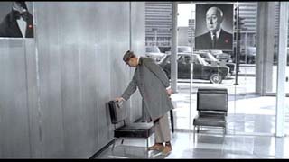
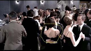
John McFarlane The first image, of M. Hulot in the company waiting room testing the sounds of a modern chair, is a visual and auditory illustration of quintessential French character embodied in Hulot with the unfamiliar environments of modernism. The scene depicts Tati’s style of filmmaking, using the long shot and deep focus to provide a variety of detail to look at. The careful use of color in the portraits of the company heads directs attention to where Tati wants it. The audio effect of the compressing chair is edited into the film allowing Tati to control the timing and comic effect. On a larger scale, the scene shows Tati’s willingness to invest in the sets he wants in order to achieve the exaggerated atmosphere he uses to caricature modernism. As in “Mon Oncle,” Tati is criticizing the new environments and objects in modern Paris and the strangeness that results from the lack of traditional and understood surroundings. Hulot is never “at home” within modernity and the result of the contrast between the traditional character and shifted context is an uncanny one. The second image shows the drunk who has wandered into the nightclub falling off his barstool. Again, the long shot allows a composition that includes a large amount of detail to consider, requiring the audience to invest attention in order to appreciate the scene. The sequence, not part of any particular plot, demonstrates Tati’s use of carefully orchestrated events in the place of a conventional narrative as a method of displaying the main subjects of the film: modern architecture and the influence of modern technology. In the sleek, new nightclub the drunk seems, like Hulot, out of place and at odds with his surroundings. That disorderly, inebriated element of French society is not accommodated for in the modern Paris. The third image is that of two women dancing with residue from the new chairs on their backs. It demonstrates Tati’s sense of humor and background in mime in the way the one woman smiles at the marks on the other’s back only to turn around and reveal similar marks. As in the first image, the chairs are too new and unpredictable. The diners are bemused like Hulot, and the strangeness of the new creates unease among those waiters who are aware of the problem. The malfunction of the new chairs in the new nightclub can be considered as an example Tati uses to express his opinion that too much change and modernization creates unpredictable and uncanny situations for people steeped in traditional French values.
|
|||||
| 9. | 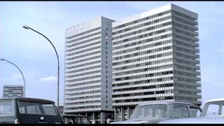 |
 |
 |
||
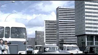
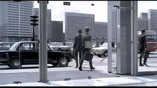
Sava Miokovic In the production of ‘Playtime’, a full scale set and background stage encompassing 15,000 square metres was constructed on the outskirts of Paris. The mini-city was built from steel and glass and included moveable, cut-down models of skyscrapers that could be strategically placed and massive street sets custom-made to carry out the director’s pre-planned intentions. The architecture was inspired by buildings presented in various architectural magazines. The min-city, later dubbed “Tativille”, cost an enormous sum of money to construct, taking three years, employing over 100 workers and requiring its own power plant to function. The
movement of Mr. Hulot through architectural space plays a primary role
in the story. Mr. Hulot interacts directly with the architecture,
bumbling between buildings, lost in space. The architecture is
used to present the central themes of the film. The modern Paris of steel and glass that Tati has fabricated makes a strong statement about the lack of authenticity in modern architecture. The modernist buildings dominate the cityscape, replacing the civic monuments of Paris. We only get a glimpse of the civic monuments that were once prominent, such as the Eiffel Tower and the Arc du Triomphe, through reflections in the glass. Although, it is made clear that that the movie is set in Paris, the set could be mistaken for! any other modern city.
|
|||||
| 10. | 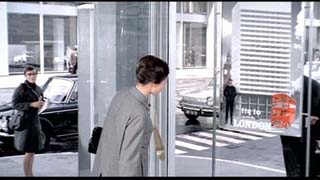 |
 |
 |
||
| Reena
Mistry (for third photo, look carefully at the scarf)
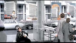
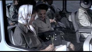
A dreary international future that Tati suggests modernism brings to the world is depicted in this set of images. Throughout the movie, Barbara/Claudia’s character is used to show a longing for the Paris that was rich in history, character and culture. The first image focuses on Claudia’s distraction by a poster of London; similarly the second, shows the posters for USA, Mexico Hawaii and Stockholm look exactly the same. In addition, Tati’s stylistic use of colour provides highlights to attract the viewer’s attention to key parts of these scenes. The first image shows the characteristic London bus in red, also the second uses a small splash of colour on each poster, the only element that differentiates each advertised destination. Off to the side of this second image, colour is used to highlight a pathetic and bored tourist slumping on a chair. The combined effect of these two images produces a strong portrayal of the modern Paris as a banal part of the globalized world. The richness of Parisian culture and identity has been left behind as unnecessary cultural baggage in the spirit of Modernism. The use of Modern architecture exemplifies this, since the building that Claudia is in and the building that is across the street and the buildings that advertise each international location have the exact same architectural icon of the Modernist tower. Modern Paris, like the rest of the world, has been reduced to trivial icons (highlighted on each poster). This constructs a disturbed future of architecture and urbanism, reminiscent to the monotonous and characterless workers in Metropolis (1927). This produces an uncanny realization of what modernism proposes to the world, and the brutal impact it will have on these international cities. All is not lost, however, thanks to the hopefulness provided by the
final image in the set. Though still painted in the cold greys of the
modernist world, Claudia wears a scarf printed with the historic city
of Paris in true Parisian style. This instils the notion that the people
of Paris, or any other city, can still hold their culture and identity,
and can never lose their history. Her small bouquet of lilies, that resemble
the streetlights outside, suggest that the world can still be a place
of possibility and imagination. Though Modernism threatens our cities,
the Hedonism of Tati’s final scenes encourages the viewer with
the potential to see the beauty in anything. |
|||||
| 11. | 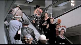 |
 |
 |
||
Melissa Ng In the film Playtime, Jacques Tati satirically criticizes Modern Paris
through the manipulation and creation of a lifeless, colourless, and
mundane world. It is clear that Tati has created this unnerving
world through the use of banal urban spaces which seem to have multiplied
and stamped themselves throughout the city, leaving nearly no trace of
humanity of the old Paris. The monotony of the city has reflected
onto the citizens of Paris as well; Parisians have adopted the colour
scheme of their surrounding elements, that being black, white, and a
bluish gray. Through the specific placement of vivid colours and
sounds in the film, Tati is able to counteract this uniformity to express
his ambition about humanity; though the city is seemingly and hopelessly
monotonous on the exterior, humanity and individuality can never be discoloured
as the city has been.
|
|||||
| 12. | 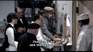 |
 |
 |
||
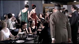
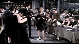
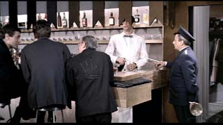
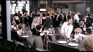
Aisling O'Carroll All three of my selected images are from the second half of Jacques Tati's film, Playtime, during the evening spent at the Royal Garden night club. The film's setting begins in an extremely ordered and sterile urban
environment of office buildings and streets. The plans and spaces seem
exceedingly rigid and ambiguous. For example, the first floor of the
office building Monsieur Hulot finds himself lost in is composed of repeated
cubicles and corridors so that the scale and program is unrecognizable.
As well, the people who fill these spaces seem completely impersonal
and similarly rigid in conforming with their surroundings. Throughout
the film Tati questions this nature of modern technology, architecture,
and its implications.
|
|||||
| 13. | 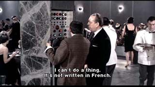 |
 |
 |
||
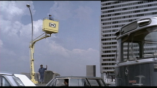
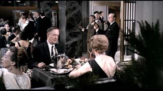
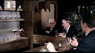
Shannon Ross (ignore caption in first image, look at woman's back in second) Playtime is a whimsical movie about the social life of modern society of Paris. Tati is commenting on the fact that Paris is now a modern city and it has become somewhat of a circus. An example of this circus like tone of the film is in the final scene when the cars are moving around the round a bout as if they were horses part of a large carousel. The play of glass was a major theme in the movie. In the final scene a repairman is fixing the pane of a window and in doing so he is moving it up and down and the reflection of the ladies tour bus, along with the sound they make, resembles very closely to a roller coaster. In the three images I have been assigned all demonstrate this circus like character. All three images were selected from the dining scene
in the movie. This
scene was full of energy and physical comedy. Very much like the
clown act in a circus show. In this sense the images seem very
uncanny because of the exaggeration of reality, to the extent of it being
ridiculous and unhomely. The first image depicts the Architect
trying to adjust the temperature. This image creates an uneasy
feeling knowing that the walls are filled with electronics that dictate
ones comfort level which are difficult and clumsy to use. This
gives the sense that being modern is something entirely new to all of
them and that they must struggle through the rough beginnings. The
final two images are simply ones that enforce the clumsiness of the machinery,
which somewhat comments on the fact that Paris is a modern city in its
infancy. |
|||||
| 14. | 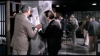 |
 |
 |
||
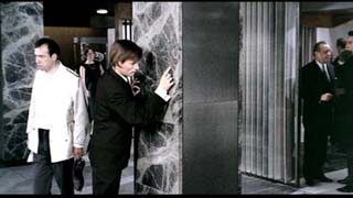
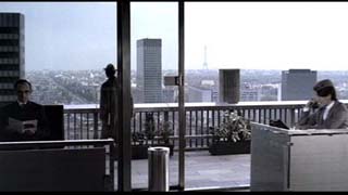
Terry Sin I believe a common theme of the “uncanny” between these three images is that Paris is unrecognizable throughout film. Throughout the film only glimpses of what we characterize as Paris (the Eiffel Tower, Arc de Triomphe, cafes, architecture, etc.) are only alluded to in reflections and in distant images. In all the scenes, whether through the characters or audience’s eyes, Paris seems to be foreign. In the first image, Hulot needs a map to help a drunken partier get to the next club. This image can be viewed in two ways, but both come to the same conclusion. It is never stated in the film whether Hulot is a Parisian. However, if he is a visitor, it is ironic that a Parisian would need a visitor to help him find his way about Paris. Furthermore, if Hulot is a Parisian, why would he need a map? Both situations allude to a sense of being lost in somewhere that should be recognizable. The second image continues this idea as the partier continues to trace his path through the lines of a marble column. Perhaps, Paris has become so immersed in America and Modernism that one cannot even distinguish between the street on a map and the veins of a slab of marble. Both seem to be equally foreign the drunken man. The third scene is a more literal translation of the uncanny presence of Paris in the film. After being taken on a wild journey through modern culture and architecture with Hulot, it is strange to suddenly remember that the movie takes place in Paris, with the Eiffel Tower and the Arc de Triomphe in the distance. However, Paris is still fairly unrecognizable as a line of modern towers overpowers classic Parisian buildings. With all the technology and capitalist ideas introduced at the beginning of the film, Paris’ charm and character are diminished.
|
|||||
| 15. | 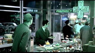 |
 |
 |
||
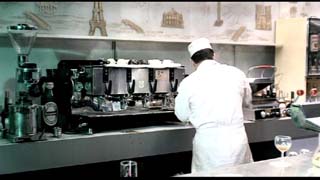
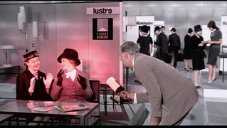
Helen Tout The
three images depicted above show 3 scenes that seem to be in
different locations with differing activities; they look like
a pharmacy, a café and a showroom respectively. |
|||||
| 16. | 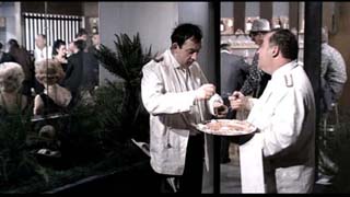 |
 |
 |
||
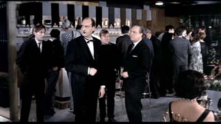
Jamie Usas The three
images above, taken from Tati's Playtime, share an uncanny commonality
of mirrored interactions that fail to see their true form. All three images
are taken from the restaurant scene which accounts for the second
half of the film, depicting an ultra modern parisian night club still
in the midst of construction despite the fact it is opening night. The
restaurant staff and patrons maintain obliviousness to the absurd
situations that arise; this theme of self obliviousness is consistent
throughout the restaurant scene. Tati employee's the stereotypic
view of the pretentious Parisian upper class and American performance
of 'continental' behaviour creating an absurdist slapstick satire. |
|||||
| 17. | 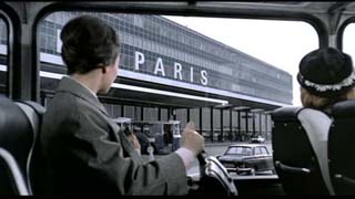 |
 |
 |
||
| Susan
Varickanickal
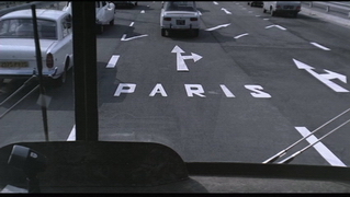
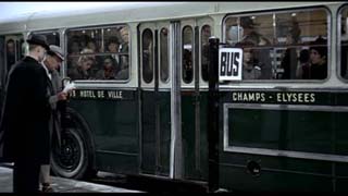
In Jaques Tati’s film “Playtime”, he uses minimal style and keeps narrative to a bear minimum in order to engage the viewer and allow the viewer to participate with the film. He is also preoccupied in his suspicion of modern technology in general and more particular of modern architecture which is an evident theme in the movie, and uses film to critique the role of modern architecture in the city. In the three images from playtime, the setting is clearly set for which the film takes place, with the obvious indications being on the building itself and on the road where the name “Paris” is clearly marked. The viewer of the film is unaware of the distinct cultural aspects of the city due to the fact that Tati has created a modern Paris, with modern architecture which is sterile and devoid of character. Today Paris is understood as a city designed and planned around specific and strategic criteria; however this historical significance in its Architecture, landscaping and culture, is lost amid the ever expanding world of modern architecture. Jaques Tati states, “The tourists find themselves at the same airport as those who left in Munich, London, or Chicago. They ride the same buses that they had used in Rome or Hamburg and arrive at a highway bordered by streetlamps and buildings identical to those in their own capital”. The reproduction of an object tarnishes its uniqueness, and this can
be seen in the three images from “Playtime”. For instance
with the reproduction of architecture from city to city the uniqueness
of it in space and time or culturally has been lost. The significance
of the first two images is that a title (Paris) was necessary for the
building and the road in order for it to be differentiated from any other
city. Western ideals of derived out of modern architecture, and
now utilized in Paris, takes away from the true nature of Paris, and
has now been characterized as another generic city with reproduced architecture
devoid of cultural value. The title “Paris” is
also necessary for the highways because it too was created in the likeness
of every other highway, and needs this particular distinction in order
for it to be separated. Likewise for the third image, the buses
are the same as the generic transit buses in every other major city,
devoid of any real reference to the city of Paris, with exceptions of
the French caption marked on the bus; however, the english title “Bus” emphasis
the role of western culture has infiltrating the values and culture of
Paris. |
|||||
| 18. | 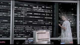 |
 |
 |
||
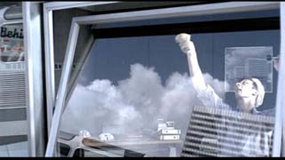
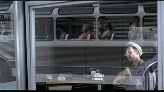
Chao Lun Wang The first image displays the American tourist Barbara standing in front of a floor-to-ceiling window of her hotel room in modern Paris. There is a strong sense of spatial ambiguity in the image. It is impossible for the audience to identify what kind of a space she is in until the camera shows a bed in the room. The room could very well be an office space, which would be constructed with the same mass-produced material of steel and glass in the same curtain wall fashion. Moreover, out side of the window is another modernist structure that gives off no clue to what it is. Its perfect, yet highly mechanical façade grid with a bluish grey tint and randomly lit rooms appears to be a large lifeless machine, or some kind of a switchboard. Tati tried to show the cold conformity and consequential ambiguity of modern architecture in Paris may have resulted in the American influence. Out side of her window, the city offers no sense of Paris, instead, the machine like mega-structures can be seen in any major city of the world. It could very well be Chicago, or Tokyo. The audience, just like Barbara, feels lost. The second and third images are from the last sequence of the film where the city becomes a larger carousel. A window washer tilts a panel of glass window up and down as he cleans it while the reflection on the mirror takes up the entirety of the screen. The reflection of the of the window shifts between sky and the ground, making the audience feel that they are the ones who are swinging. The effect is deepened by the ‘Woo!’ and ‘Ah!’ made by tourists in sync with the movement of the window panel. This scene would be rather lifeless if it were static. It’s the human nature that breathed life into this scene, or at large, the city. The technologies and materials of the modern era have been portrayed, for the most part, being interfering with natural human interaction. However the movement of a lifeless glass panel connects the characters of the film into one large amusement ride. |
|||||
| 19. | 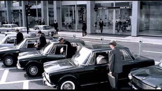 |
 |
 |
||
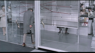
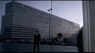
Benjamin Wong In this first screen shot, Tati is depicting the idea of uniformity as a product of the modern world. This scene shows four men getting into four identical cars, actions in sync with one another, and with a modern building serving as the backdrop. It is important to notice the blandness and lack of variation in colours: everything is a blue/gray tone. This lack of colour serves to enhance the visual message of uniformity presented in this scene. The people in the background, who are dressed in identical black suits and white dress shirts, carrying black briefcases, further supports this idea. This scene might be connected to that of the 1927 Metropolis. In particular, the opening scenes of the underground workers, soullessly marching in unison to change shifts. Both are able to portray “the uncanny”. This second scene is perhaps Tati’s commentary on the uniformity of space in the modern world. The glass doors that the character of Monsieur Hulot enters through in this scene are identical to those of any other glass doors he finds himself mindlessly and often involuntarily being led through. These places he enters into are essentially identical except for the interior furnishings. Furthermore, this scene is one of the more comical situations of the film, as the audience sees the scrambling dance of the feet of the sales agent behind the sign. The absurdity of this scene points out a flaw in the architecture of a modern building constructed without proper consideration of the program it is to sustain. The glass also lacks proper consideration for privacy. The third scene is a juxtaposition of man and the modern architecture of his built environment. The man has just left the chaos of the party at the restaurant to find himself thrown back into a harsh coldness of steel and glass. This also shows the opposing aspect of humanity versus technology. The image seems to question what the modern world truly brings; modern technology brings us convenience, but at what cost? Is the convenience of modern technology worth the price of humanity? |
|||||
| 20. | 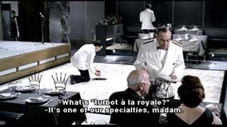 |
 |
 |
||
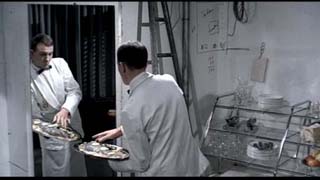
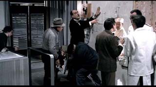
Erin Corcoran (ignore caption in image one - look at the fellow and the floor tile) Throughout Tati’s Playtime, there are multiple scenes in which the film pokes fun at the follies of over idealized or simplified ‘modern’ design. Chairs that are not comfortable but look good, buildings are clean but empty, coffee shops are alienating in their transparency but perfect in their use of curtain wall. The characters of the film try to live within this designed world, but are often portrayed in opposition to or having difficulties with this perfect modern world. In the case of the restaurant scene, shown in the three images above, the restaurant is a design nearly completed that is forced to occupancy before the construction is complete. However, in order to maintain this ideal of perfection, the construction workers and the architect are shuffled to the back of house, and guests are invited, even though it is not ready. In the first image, a waiter is forced to repair the broken dance floor so that the guests do not have to see an ‘imperfect’ construction worker while they eat, in the second, the architect, told of the problem of the floor tiles stares only at his ‘perfect’ drawing instead of examining the floor itself, and in the third, a waiter gets his hand stuck in the back of an over-designed chair, emphasizing the fact that the design ideals, though looking good on paper, are improbable in practice – it is difficult, and sometimes nearly impossible to perform normal actions within this modern designed environment. The commentary present within these metaphors and actions is a message against the overarching simplicity of modern architecture and design. It is an ulterior opinion, asking individuals to consider the fact that even though the results of these designs look clean and simple and perfect, they fail to respond to the needs and actions of the people within them, emphasizing that this attitude of covering up unwanted bits to preserve the lie of perfection is not a realistic option. |
|||||
| 21. | 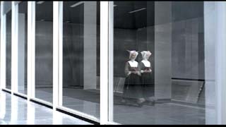 |
 |
 |
||
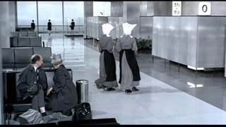
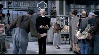
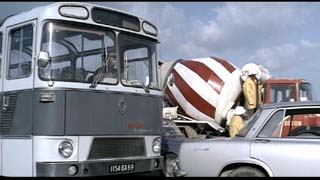
Matthias Heck During one of the first scenes at an undisclosed location we see various characters passing by, each with their unique look and gait. In this setting two nuns with fluttering bonnets appear, their appearance being part of the big choreography that follows. By using the wide-screen format and due to the set design the audience’s focus is on the nuns for that whole scene. It is not until a later scene that the actual location, an airport is revealed: a shiny and sterile environment that is characterized by its generic architecture and colour, and the contrast of black and white. So, the fluttering of the nun’s bonnet is not only a comical moment in the choreography, but also serves as a ironical reference to the location. In the general narrative structure Tati is using in Playtime, new characters seem to appear randomly or in a “cascade of incidents” rather than being introduced in a classical way of storytelling. Furthermore, the wide-screen format he uses creates the effect of a wide space, where the viewer’s eyes can roam around freely and discover new details or characters that are somehow part of the whole setting, or just enter the scene. During one of the last scenes at the drugstore, where craftsmen repair the neon sign of the store, the letter O randomly lightens up and creates a halo over the priest that is standing under it. This seems to be a malfunction of the modern technology, a motive that Tati repeatedly picks up and plays with in his movies. But the random creation of the halo over the priests head, enhances by the sparkling sounds, also draws the audiences attention to that occasion, so Tati is using that event within the whole wide-screen shot as a stylistic device to highlight a part of the crowded scene in the drugstore. These scenes including the religious characters in a certain way frame the movie. They are interesting because Tati is using those different stylistic devices to draw our attention to a specific event or person(s). One might even go further and say that in a modern and changing world that Tati portrays, the religious characters stand for traditional ethics and values that can be distinguished from the fast changing values of modern life. This especially makes sense as the nuns appear before the avalanche of events is triggered, and the priest appears after the frenzied and chaotic climax that took place in the nightclub. For us, the audience, this might be just another of Tati’s reminders to identify and question those new values.
|
|||||
| 22. |  |
 |
 |
||
| Lejla
Odobasic |
|||||
| 23. | 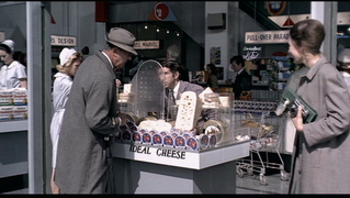 |
 |
 |
||
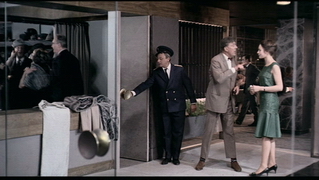
Suzanne Gibson These three captions are a commentary on the mindlessness
of our everyday activities. One film critic Rosenbaum writes ‘[Playtime]
directs us to look around at the world we live in (the one we keep building),
then at each other, and to see how funny that relationship is…” (http://rogerebert.suntimes.com)
As Rosenbaum writes, all three of these captions capture the absurdly
of world we have created, and ridiculousness of our actions within this
built environment. The characters actions are prescribed by their environment,
they behave a certain way not because it makes sense, but because that
is the way they are suppose to behave. As seen in the first image,
where M. Hulot is speaking to a vender through a security screen despite
being in an open market, the screen itself is pointless, yet the vender
makes a point of only speaking through it when addressing customers.
This image is particularly humorous because there is a piece of Swiss
cheese next to screen that mirror it, the silliness of this scene is
lost on all the characters except for M. Hulot who seems to be the only
one aware of how silly the situation is, and because of M. Hulot awareness
he seem out of place within the city. Similarly in the next caption
the doorman continues to open the door even through there is no door.
When crowd begin to move through another door way the doorman moves to
open that non-existence door. He opens the door not because it
is necessary but because that is what must be done before a person can
enter another space. In the last image M. Hulot walk out of a shop
not using the turnstile but rather a bowl of spoons that mimics and mirrors
the turnstile (similar to the cheese and the screen in the first caption),
a man watching him insist that it is not an exit, and directs him back
to exit through the turnstile. The act of re exiting is as pointless
as speaking through the screen in an open market was, and the doorman
opening a door that does not exist. I think the humor is that it can
so easily be related back to the audiences own lives, for instance, a
few weeks ago I went to a vendor and made a purchase using my credit
card, the card was unsigned, the vendor got me to sign the back of my
credit card and then sign the receipt, she then took my card and the
receipt and compared the signatures, after I had just finished signing
both of them moments before right in front of her. Like in the
captions the act of comparing signatures is redundant, of course they
are going to look alike, the vendor compared the signatures because that
is what she always does without thinking, just as the characters had
acted in the way in which their environment prescribed without thinking. |
|||||
| 24. |  |
 |
 |
||
Kate Gould The final scenes of Jacque Tati’s Playtime form the final impression in the audience’s mind of his commentary on Modern Paris. These scenes are very calming and poetic when juxtaposed with the frenzy of the restaurant scene. They follow the final day of the tourist group, who are returning home after their Parisian tour. These still images capture Barbara’s final images of Paris and its impression on her. Before she leaves Hulot catches her and gives her gifts to remind her of Paris – a scarf with images of Parisian monuments and a flower from the street vendor. I think the significance of these simple heartfelt gifts is central to Tati’s commentary on modern Paris, which is that of a city overwrought with consumerism. In such a simple gift Hulot was able to capture the heart of Paris, whereas all of “souvenirs” and modern day appliances that were in the tradeshow were ridiculous in their consumerism. The broom with headlights is the perfect example of how design for modern convenience has become a farce. Tati comments on how Paris like many other modern international cities has become generic. The features that once distinguished the city become ephemeral and disconnected with the modern experience. The great irony of the movie is that the Paris in Playtime is decentered and displaced from the heart of the city with only traces remaining – such as the woman selling flowers on the street or the reflections caught in the glass skyscrapers of the classic monuments. Overall, the tour group has seen even never seen the real city. The final scenes then complete the accelerated day-night cycle of the movie returning along the same highway to the airport. This is a powerful technique as we see the same scenery as in the opening sequence but look upon the landscape differently. The viewpoint changes from showing the bus disappearing into the traffic to that of the young woman looking out the window. One experiences her final glimpses of Paris, which are most poetic. The streetlamps are seen in their simple form - the city is reduced to blinking lights against a dark sky. This makes one appreciate their pure form, similar to that of the little white flowers, against the dark sky. As the light of the film movie fades the lamps are lit up, such that all you can see is their light, the modern day image of the “city of lights”.
|
|||||