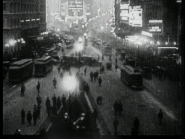
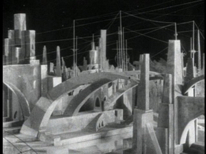
The second group of films are those which present a view of an Earth style and contrast it with that of another planet, or at least a place disaccociated from our own.
i) Aelita (1924)



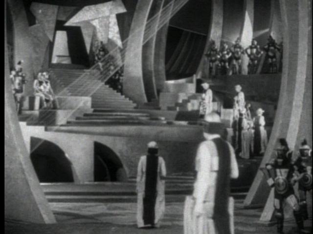
In Aelita, the architecture is all about style. It is meant to act as a strong and very obvious juxtaposition to the cramped, old, and decaying architecture of 1920's Moscow. Portrayed primarily as an interior style, the set displays a world of sensuous curves, sweeping stairs, and immense, enduring constructions. As an architectural style, the solidity gives off the impression that it has been there for quite some time and will remain there for some time to come. This hardness and uniformity of material (presumably concrete-esque) is contrasted with the smooth and flowing forms it takes. The style directly illustrates that this Martian society is further ahead than that of Earth's, with its frail and dilapidated wood buildings. The architectural style of Aelita also works its way into other aspects of the film, especially costumes. The fashions are equally graceful and flowing and indicate a more universally applicable mindset of style than that held on Earth.
ii) Solaris (1972)
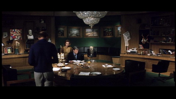
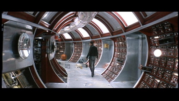
The Russian film Solaris illustrates contrast through brief scenes played out on Earth, but most noticeably the differences are seen on the space station itself. The juxtaposition of the library and the other spaces on the station highlight very vividly a keen difference in styles. One is in tune with antiquated style, literature, philosophy, and the arts, while the other pays homage to the virtues of technology and gadgetry. The warm and luxurious style of the library is contrasted with the cold and monotonous interior of the space station. By bringing this kind of style along with them into space, the cosmonauts are perhaps attempting to ensure they do not lose all sense of humanity in the impersonal style of the station.
iii) Total Recall (1990)
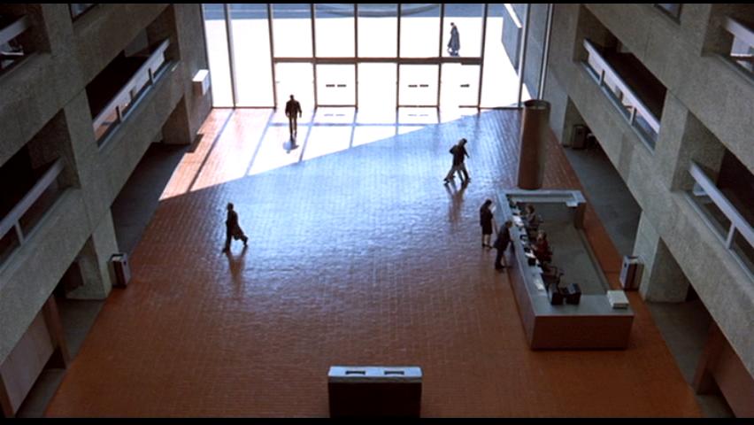

Total Recall also makes very direct and obvious comparisons between the architectural style of Earth and that of another planet - again Mars. In this 1990 "flick", the architectural style of Earth is seen as very modernist and even brutalist - clean lines, excessive use of concrete, and monotony of colours (everything is gray). The director, Paul Verhoeven, chose Mexico City to film these scenes for its plethora of thoroughly modernist districts. These districts denote an architectural style devoted to efficiency, grandeur, technology, and uniformity. Any of the buildings could be placed anywhere else and the same effect would prevail. A style of sharp, clean, angled lines prevails, alluding to images of organization, bureaucracy, and government.
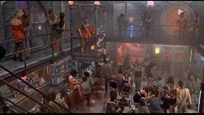
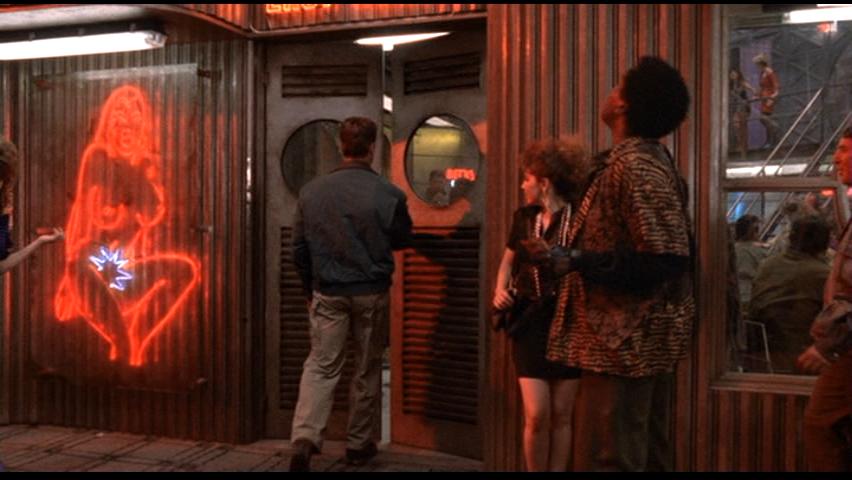
The styles on Mars are shown to be quite different. Instead of the solid, uniform buildings of Earth, the Martian style is much more porous, with the architecture using a large variety of metal and steel grates. It is equally as cold and distant as the concrete style portrayed on Earth, but at the same time stirs a far more human sentiment due to its porosity. One has very little privacy with this style, and in that sense feels very connected to the people around them. The scale of the architecture also contributes to this human element, with the Mars settlement taking on a far more human and appreciable scale than the massive structures of Earth. The repetitive symbol of the circle as a stylistic element contrasts with the linearity of Earth. The circle is human symbol, relating to cycles of life and nature.
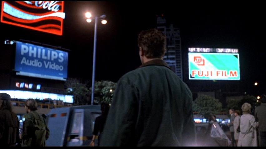
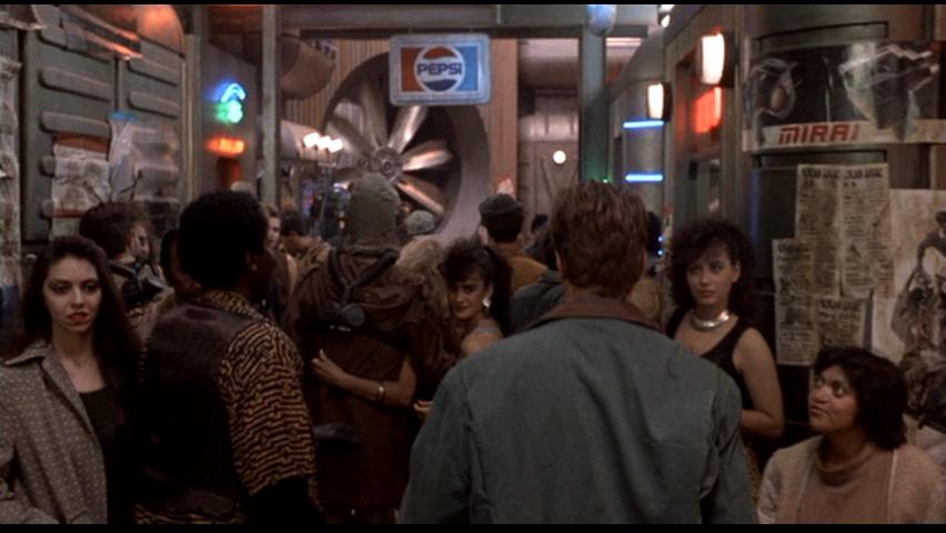
Interesting in this film is the element that ties the two representations of architecture together - advertising and corporate involvement. On both planets one can see numerous representations of all the big companies of today - Coca Cola, Pepsi, Philips, Fuji Film, etc. The addition of these recognizable elements lends a strong degree of legitimacy and immediacy to Verhoeven's architectural styles. They illustrate that even in the styles of the future (or not-so-future), depiction of corporate interests will still exist.